Theoryland Resources
WoT Interview Search
Search the most comprehensive database of interviews and book signings from Robert Jordan, Brandon Sanderson and the rest of Team Jordan.
Wheel of Time News
An Hour With Harriet
2012-04-30: I had the great pleasure of speaking with Harriet McDougal Rigney about her life. She's an amazing talent and person and it will take you less than an hour to agree.
The Bell Tolls
2012-04-24: Some thoughts I had during JordanCon4 and the upcoming conclusion of "The Wheel of Time."
Theoryland Community
Members: 7653
Logged In (0):
Newest Members:johnroserking, petermorris, johnadanbvv, AndrewHB, jofwu, Salemcat1, Dhakatimesnews, amazingz, Sasooner, Hasib123,
Theoryland Tweets
WoT Interview Search
Home | Interview Database
Your search for the tag 'art' yielded 133 results
-
1
Interview: Nov, 1993
Trinity College Q&A (Paraphrased)Emmet O'Brien
Robert Jordan arrived at 6:00 this evening in Trinity College for his talk...this being Ireland, the talk didn't start for a further ten minutes, but in the meantime he signed books for those of us who actually turned up on time. The turn out was pretty disappointing considering The Fires of Heaven is number two on the best-seller lists here: only about thirty people were there including SF society mafia. He didn't have any prepared speech but took questions from the floor.Robert Jordan
He still isn't sure how long WoT will go on for, saying probably seven books but adding that when The Eye of the World first came out he saw the series as four books. He does however know what the ending will be and how all the major story lines will resolve. He expressed vague dissatisfaction with the covers but didn't seem too upset about them.Tags
-
2
Interview: Dec, 1993
Letter to Tom McCormick (Verbatim)Robert Jordan
With regard to the covers, both my editor and I have fought long and hard to get them to be the way they should be. And obviously with a high futility quotient. Countless descriptions of Trollocs, pointing out that Rand is approximately 6'5"–6'6" tall, descriptions of the swords, of Perrin's axe, etc.
The "dwarf Moiraine on a pony" problem was only the first, along with Lan being in armor and the Robin Hood clothes. I do not assign blame. On those occasions when either my editor or I have been able to speak directly to Darryl Sweet, the problems in sketches have been solved handily for the most part. (You did not realize that there were discrepancies in the sketches which never made it onto the covers, did you?) Sometimes you just give up after awhile; with Rand's height, for instance. After five books showing him as maybe 6' tall, I've simply bagged trying for the extra 6". As for the changing hair colors, I fear you must look to the printing process for that blame. When we see the cover painting, all colors are as we wish them to be, but then we must hope that the colors are reproduced with some degree of faithfulness on the actual covers. The expense of printing covers and/or dust jackets is such that no publisher is going to throw away a set and reprint simply because the characters' hair has changed color.
Now for your questions.
Tags
-
3
Interview: Dec 8th, 1993
Letter to R. S. Cerveny (Verbatim)Robert Jordan
I am not overly fond of the covers myself. My editor and I have fought long and hard to try to make them right, and on those occasions when we were able to speak directly to Darryl Sweet (the cover artist) most problems were taken care of in short order. On other occasions, though, when we had to go through other people at Tor, seemingly endless descriptions of people, clothes, weapons, Trollocs, etc. produced either nothing like what I envisioned or else something only close.Tags
-
4
Interview: Oct 17th, 1994
LOC Signing Report - Daniel Rouk (Paraphrased)Daniel Rouk
He mentioned the height of all the characters. Erica wrote those down. Basically repeated PNH's account of why the colors of the covers are always different.Robert Jordan
The Old Tongue is a mix of Gaelic, Russian, Spanish, Japanese. A lot of different sources that are not traditionally used to make up fake languages. He has only a few phrases and a few small guides on usage written down.Tags
-
5
Interview: Oct 17th, 1994
LOC Signing Report - Erica Sadun (Paraphrased)Robert Jordan
Covers: Rand originally had Darrel K. Sweet's build. Finally he's tall enough. The monkey girl is Egwene. "They're fine." (the covers)Tags
-
6
Interview: Oct 20th, 1994
LOC Signing Report - Delemin (Paraphrased)Robert Jordan
He expressed several views about various translations of WoT. He heard the Swedish translation was very good, and the Dutch translators had an extensive correspondence with him. He said the only translation he read was the beginning of the German translation, but he hated the covers, he mentioned one as featuring a rear view woman, wearing only a strand of pearls, raising her hand to stop a band of armored horsemen. His favorite covers were on the Spanish editions.Tags
-
7
Interview: 2011
Twitter 2011 (WoT) (Verbatim)Brandon Sanderson (3 January 2011)
Reading the start of The Eye of the World reminds me that there's an extra person in the cover art. (More obvious in the secondary, inside piece, I think.)RINA
In the cover of The Eye of the World there's only Moraine, Lan, and one boy to the side. Am I looking at the wrong one?BRANDON SANDERSON
There are two covers. One ended up on the inside flaps. The outer one wraps around, though, and I think he's in both.BRANDON SANDERSON
Here's the secondary cover: http://bit.ly/hZu0UwBRANDON SANDERSON
HCFFs already know who that person is, but it's a fun Easter egg to know that there's a story behind that extra figure.BRANDON SANDERSON
By the way, HCFF stands for "Hard Core Fan Freak" for those asking. They're self named. It's what many uber-wot-geeks call themselves.BRANDON SANDERSON
Mr. Jordan wrote a large chunk of The Eye of the World with a fourth Two Rivers lad going along with Perrin, Mat, and Rand. Was to be a major character.BRANDON SANDERSON
Harriet talked him out of it, pointing out that the fourth lad never did anything useful. @theoryland, do you guys have a good thread on him?TEREZ
Nah, nothing to talk about really. But here is RJ saying that: http://bit.ly/RJ-BN2000BRANDON SANDERSON
I've asked Harriet if she could dig up any of the old manuscript with the fourth ta'veren in it, but she's not certain they have any.BRANDON SANDERSON
She said she thinks he was Dannil, but couldn't remember for certain. Many think he was Ewin—a good guess and a possibility.BRANDON SANDERSON
Cover art was commissioned when he was still a main character, and it was too late to change it when he was removed.BRANDON SANDERSON
Looks like the fourth ta'veren was Dannil, in another form: http://bit.ly/h0iDIO (Look for Liandra's question.)BRANDON SANDERSON
Jason from @dragonmount says: "RJ once told me that Daniell's heroics ended up being done by the other Two Rivers boys."AZRAL HANAN
What role would the so-called 'Fourth' ta'veren have played if he had been written into the story? Could you elaborate?BRANDON SANDERSON
I'd like to see the original drafts if I could. I do know RJ said his part was split among the other three.RINA
Is the fourth boy (Dannil)'s name pronounced [dan-nil] or [daniel]?BRANDON SANDERSON
I say the first.Footnote
Some fans think this is a BS story made up as an inside joke between RJ and Harriet about the cover art, mostly because the concept of three heroes seems to work better with the mythology that RJ used to develop them.Tags
-
8
Interview: Oct 26th, 1994
LOC Signing Report - Greg (Paraphrased)Greg
I couldn't resist telling him that I really dislike the cover to Lord of Chaos because I've had three people who know nothing about WoT see me reading the book and think I'm reading a cheesy romance novel because of that terrible picture of Rand.Robert Jordan
RJ replied that they probably thought I was reading soft porn, and that some of those cheesy romance novels I was talking about are some of the best soft porn he knows of. Later someone asked to have his picture taken with RJ and he replied, "What kind of picture are we talking about? I'll only do it if I get to keep my clothes on." Oh, and RJ said that the woman on the cover of Lord of Chaos is an Aes Sedai of the Red Ajah, but he doesn't know which Aes Sedai because it was changed a number of times.
Tags
-
9
Interview: 2011
Twitter 2011 (WoT) (Verbatim)Brandon Sanderson (14 March 2011)
Man, this Shadow Rising ebook cover really is full of awesome, isn't it?MICHAEL GIGLIOTTI
Mat looks so dark; it's a very stark contrast to his personality.BRANDON SANDERSON
That was one of my first thoughts too, but he does get grim once in a while. Particularly after being killed...BRANDON SANDERSON (20 MARCH)
Another one for the "Huh, never noticed that before" file. Some Aiel tell Mat is death for him to enter Rhuidean. And they're right.TEREZ
Are they?BRANDON SANDERSON
By Mat's perspective. Though he's not 100% sure.MANAR
Wait. No. Mat does not die in Rhuidean, does he? I thought his death came when Rahvin strikes him with lightning.BRANDON SANDERSON
Mat thinks it counts. Of course, that whole Rahvin thing isn't something he remembers...Tags
-
10
Interview: Oct 30th, 1994
LOC Signing Report - Matthew Hunter (Paraphrased)Robert Jordan
He is aware of us, and the Bela discussion. We had a rather long convoluted discussion about Bela and the Darkfriend social, which seemed to leave everyone else clueless, when I identified myself as a net.jordanite...
We complain about the Sweet covers. He complains about the German covers. (Well, not much. But one in particular had a naked woman wearing pearls holding back an army with a wave of her hand (The Great Hunt) and "I had no idea where they got that one.")
You don't want to hear about his British agent.
Tags
-
11
Interview: Oct 30th, 1994
LOC Signing Report - Matthew Hunter (Paraphrased)Robert Jordan
Newsflash!
The covers aren't as bad as we thought they were. The 'extra' character in The Eye of the World really was in the book, but was cut out later, because he had too little to do. His parts were distributed out to the other characters, but they never got around to cutting him from the cover.
Tags
-
12
Interview: 2011
Twitter 2011 (WoT) (Verbatim)sleepinghour (6 July 2011)
Is it true that WoT will be reprinted with new covers once the series is finished? If so, will those be the ebook covers?Brandon Sanderson (6 July 2011)
Nothing is confirmed yet. I've suggested it, but the choice is Harriet's. Right now, she doesn't want a reprint.Tags
-
13
Interview: 2012
Twitter: AMOL Writing and Editing Process (Verbatim)Brandon Sanderson (11 August 2011)
I moved the A Memory of Light progress bar up one more point, to 38%. Slow going this week. Head cold + lots of pre-writing to do + sister's wedding.Jay
Will A Memory of Light actually be the last book? or do you think you will split it up again? Are you thinking of 2012 release?Brandon Sanderson
It will not be split. I'm pretty certain. 2012 for sure.
Greg Lindsey
Hi Brandon! Any guesstimations on when we might see A Memory of Light cover art? Thanks!Brandon Sanderson
I was just asking Tor about this, actually. I think it's a little ways off. Maybe first of next year.Tags
-
14
Interview: 2011
Twitter 2011 (WoT) (Verbatim)Chris Jaworski (25 August 2011)
I know this is a long shot but can we expect any cover art drafts for A Memory of Light soon?Brandon Sanderson (25 August 2011)
Got a question from @SaintChristobel about A Memory of Light cover art. It's in the works. I'm told it will be ready for reveal at the end of the year.BRANDON SANDERSON
Mr. Sweet is working on it, and I've seen early drafts. They look good.Isabel(26 AUGUST)
What kind of good? Good compared to the other WoT covers or good compared to for example the ebook Mat cover?BRANDON SANDERSON
Good for a Sweet WoT cover. I like the design, and it plays to his strengths.Tags
-
15
Interview: 2012
Twitter: AMOL Writing and Editing Process (Verbatim)Brandon Sanderson (30 August 2011)
Writing A Memory of Light makes me tired. There are a lot of exhausted people in this novel.LUCKERS
Have you seen this A Memory of Light fan art of the ta'veren? It's fickan awesome. http://tinyurl.com/4qtxjusBRANDON SANDERSON
I've seen it, and I do like it a lot.Tags
-
16
Interview: 2010
Twitter: TOM Writing and Editing Process (Verbatim)Brandon Sanderson (2 August 2010)
Onward. Need to get a tweaked draft of Towers of Midnight to Harriet tomorrow. Two weeks left on our deadline to get the final, final draft to Tor.BRANDON SANDERSON
Going through Towers of Midnight and adding chapter names/icons (both chosen by Harriet) and combining chapters at her direction.NICK CASSANOVA
With the newly combined chapters, which is the sad chapter that you had said was number 60?BRANDON SANDERSON
Don't know yet. I have to check with Harriet on a few more combinations before I will have a final chapter total.BRANDON SANDERSON
Today's task: Going through Towers of Midnight and giving italics/cap letters to in world terms. (And taking away caps from others that I got wrong.)PETER AHLSTROM
Ditto. (Re-tweet)BRANDON SANDERSON
Working on epigraphs for Towers of Midnight right now.BRANDON SANDERSON
Q: Now that the chapters have been changed around, what is the new number of chapter 81? (The one you said was one of your favorite?)BRANDON SANDERSON
A: That is now chapter 50. It should remain there.BRANDON SANDERSON
Good question: @graphicbin_sean asks "Who chooses the scenes for the cover art for WoT? How about Towers of Midnight?"BRANDON SANDERSON
A: Harriet usually picks. I picked the scenes for Towers of Midnight and A Memory of Light, though, as we had to get them painted before Harriet read the books.SHIVAM BHATT
Who writes the [glossary] entries at the back of every WoT book?BRANDON SANDERSON
Maria does those.Tags
-
17
Interview: Apr 5th, 1996
BaltiCon XXX - Pam Korda (Paraphrased)Robert Jordan
The Guide to the Wheel of Time: Out sometime this year, I think. Art by Todd Hamilton—anybody know if this guy has done anything we'd recognize? At least it isn't DKS! Stuff that will be in there: History of Artur Hawkwing, History of the Post-Breaking Aes Sedai, the Seanchan, the Aiel War and the final battle outside Tar Valon.Tags
-
18
Interview: Jun 21st, 1996
Brian Ritchie
I think that's all that was said of any significance. The rest was personal info that I don't think is important here, and I'm not sure a lot of this was either. BTW, both Mr. and Mrs. RJ are very friendly, outgoing people and were fun to talk with.
Am I the only one that thinks he looks like an older Bayle Domon?
This could lead to some interesting speculations. From his web site picture, I'd say Novak might be related.
Robert Jordan
RJ seems to actually like the DKS covers. However, he disliked the cover of one of his books that someone brought. (I believe it was the UK version of The Great Hunt.) It was mostly light blue and lavender/purple. He disliked the artwork, not just the color scheme.Tags
-
19
Interview: Jun 26th, 1996
Compuserve Chat (Verbatim)Searles O'Dubhain
Speaking of illustrations, do you feel the cover illustrations to your books accurately reflect your characters and settings?Robert Jordan
Probably as well as they could without me doing the drawings. There is no way that someone else can do an illustration that gives exactly the image that is in my head. Given the limits on how much description I can give Daryl Sweet when he's doing his cover paintings, he's doing a good job. The only way to do it better is do it myself, and I have no skill there!Tags
-
20
Interview: Jun 27th, 1996
AOL Chat 1 (Verbatim)OMNI Muse
Robert, we're getting questions about cover art. Do you get to choose the artist? The theme?Robert Jordan
I choose the them...the theme, that is, and I give the cover art a general idea of the scene that I want. But then it's worked between him and the art department in NY. I do have some input and I have managed to get a few things changed to some degree. Rand, for instance, in the earlier books, was shown as no more than 5'-10" or 5'-11", and he is about 6'-5", in my eyes.Tags
-
21
Interview: Nov 11th, 1997
Barnes and Noble Chat (Verbatim)Ayla Sedai from the White Tower
I am in two online guilds based on the Wheel of Time series, but I heard you have officially approved one. I have also heard you approved no guilds. Which guild, if any did you approve? (And why did you let Darrell Sweet do your book covers—the Armylin wants to know.)Robert Jordan
I have approved several fan clubs who wrote to me and asked me to endorse them. I don't approve anybody exclusively. As far as Darrell goes, he was selected by the publisher.Tags
-
22
Interview: Oct 19th, 1998
Barnes and Noble Chat (Verbatim)Nansen from Ithaca, NY
Hi, Mr. Jordan! I love your books! I have both the hardcover and paperback editions of all the Wheel of Time books. Can you please tell us why the cover to the paperback edition of A Crown of Swords is different from the hardcover? Thanks!Robert Jordan
I'm afraid that was purely a marketing decision. Tor Books felt that there were stores and outlets that would not accept a fantasy cover. And they seemed to have been right.Tags
-
23
Interview: Oct 19th, 1998
Barnes and Noble Chat (Verbatim)Tempest from xtempestx@msn.com
Do you feel that the cover for The Path of Daggers is accurate or inaccurate of the things inside, considering some of the past work?Robert Jordan
I think it's much more accurate than most of the previous covers.Tags
-
24
Interview: Oct 29th, 1998
TPOD Signing Report - Kevin Bartlett (Paraphrased)Robert Jordan
Somehow, the topic wandered over to his Conan novels, and one of the as to whether the scantily-clad warrior-woman should be flung over Conan's shoulder on the cover, or held tightly to his chest. Jordan (dirty old man that he is) quipped that "over the shoulder" was the obvious choice, for perfectly mercenary reasons. He then went on to say that if the cover art included some only partially covered buttock, that the book sold markedly better. He also claimed that it made little difference whether it was the amazon's skin or Conan's, which got a rise out of the observers. So I asked the obvious question: "Are you going to have a talk with Darrell Sweet about this?" He gave a wry grin and said, "This is a different kind of series..." But he did say that he has gotten several letters asking for Rand's butt to appear on the cover...Tags
-
25
Interview: Nov 15th, 1998
TPOD Signing Report - Michael Martin (Paraphrased)Michael Martin
Like Matthew Hunter (see his post), I was surprised by the candor of RJ's remarks regarding Sweet's covers. At least we know he is just as exasperated by them as we are. If only Michael Whelan and Jordan had been able to work a deal out—man. Talk about poster-worthy and collectible art.Tags
-
26
Interview: Nov 14th, 1998
TPOD Signing Report - Matthew Hunter (Paraphrased)Robert Jordan
Someone asked how he chose the cover artist, and we got a nice long spiel with some previously unknown information. Jordan and his wife went through bookstores picking out books based on their (if they liked it) cover art and finding out who did the cover. It came down to two artists, Darrell K. Sweet and Michael Whelan. The deciding factor was that Whelan wants the manuscript to read for a year before he will deliver a cover, and they just couldn't wait that long.
They are apparently considering a later reissue of the entire series with different covers, perhaps by Whelan, once it is complete.
Some stores simply won't carry fantasy, so all the books have been issued without cover art to expand the market. This came up in response to the A Crown of Swords paperback being artless. Why we haven't seen any of these others without art, I don't know.
Sweet Criticism and General Commentary:
—Rand is NOT tall enough.
—The Path of Daggers details are mostly right, at least.
—Rand has a different face on each cover.
—DKS has never done the Trollocs right: "They are NOT hairy men with animal-like helmets."
—Detail problems with Sweet are due to communication difficulties; there is not much time or opportunity for input.
—The Path of Daggers: "The Elvis cover."
—A Crown of Swords: "The pugilist cover."
—Lord of Chaos: "Take my room key, please!"
Tags
-
27
Interview: Nov 11th, 2000
Barnes and Noble Chat (Verbatim)Liandra from The Netherlands
I understand there would be a person in The Eye of the World, but that he was cut out or something. Who was he?Robert Jordan
One of the characters who I have brought in later was a fellow named Daniell in The Eye of the World, and I brought him out because I realized he didn't have anything to do there. I reintroduced him later. At that point, he was simply taking up space.Footnote
There was a detailed conversation with Brandon on this subject during his re-read of 2011.Tags
-
28
Interview: Nov 11th, 2000
Barnes and Noble Chat (Verbatim)Henrik from Tampere, Finland
Mr. Jordan, what is your stance on uncommissioned fan illustrations depicting the world you've created?Robert Jordan
I really don't have a stance. I know a lot of people do fan art of one sort or another. As long as no one is trying to make money on my creations, it's all right with me!Tags
-
29
Interview: Nov 11th, 2000
Barnes and Noble Chat (Verbatim)Missy from Oregon
Do the portrayals of the people on the covers match what you think they look like?Robert Jordan
Yes and no. It's very hard to get an artist to portray someone just as you see them. If I were an artist, perhaps the covers would show the people EXACTLY as I see them. But since I'm not, we have to make do with me giving descriptions to the artist.Tags
-
30
Interview: Dec, 2000
Orbit Interview (Verbatim)Orbit
Of the nine books published so far, which one has your favorite cover?Robert Jordan
The Eye of the World.Tags
-
31
Interview: Jan 16th, 2003
Robert Jordan
About the Conan books: RJ said there was an odd phenomenon: if someone's ass was showing on the book cover, the book sold better (better than non-ass-showing Conan books, presumably).
Tags
-
32
Interview: Sep 1st, 2005
DragonCon Report - Jennifer Liang (Paraphrased)Jennifer Liang
The next big event was a Q&A session with Darrell Sweet.Darrell Sweet
Darrell explained the process by which the WoT covers are made and why they look the way they do. He explained that he thinks of the covers as being advertising posters for the books and are designed to catch attention. He tries to make sure that he can tell it's a "Wheel of Time" novel you're looking at; opposed to the covers he does for other series.
He also explained that Tor frequently asks him to make changes to the art to suit the needs of the cover layout. For example, he was asked to make the figure of Perrin on the cover of Knife of Dreams shorter. As you can see by looking at the cover, if Perrin was the proper height, the text would cover part of his head.
He also related an amusing story about the cover from The Dragon Reborn. The Jordans own the original, final painting that became the cover for this book. They have it hanging at the end of the hallway by the stairs. A few months after the painting was delivered, Darrell got a call from Harriet asking if he could "fix something" for her. Of course he could! What was it? Well, she could see the floating head of Ba'alzamon from the spine from her bed at night and it bothered her. Could he please remove it? So Darrell obliged and now the painting we all know as the cover for that book no longer exists.
Tags
-
33
Interview: Oct 19th, 2005
KOD Signing Report - Jeff Bumgardner (Paraphrased)Robert Jordan
Anyway, when he signed my books I just asked him what he thought of the Darrell K. Sweet covers, and he said they were okay, but that he has minimal input on them. Sometimes he suggests scenes, and when he gets to look at the paintings prior to publication he suggest changes, but in the end basically Tor does whatever they want with it.
A friend of mine ahead of me in line asked RJ if he would ever do any more Conan books and he said no, he only did them because he needed the money at the time. Obviously, he doesn’t need money anymore. ;^)
So that’s it. Nothing too exciting. At least I got to finally meet him after so long.
Tags
-
34
Interview: Feb 13th, 2007
Robert Jordan's Blog: A LITTLE CONTEST (Verbatim)Robert Jordan
Hi, guys. Sorry this isn't the usual health update, but I'll get to that in another post shortly. A few days, but no more, I promise. This is about something else completely. In fact, it was inspired by a comment someone posted on the blog. I liked the idea and took it to my agent and my publisher. They like it, too.
We are going to run a contest to find the 15 best pieces of fan artwork out there. I know there is some really professional quality work because I have seen it. Submit your work to Jason Denzel ( those who read a version of this announcement on a few other sites will see somebody else to submit to; dinna fash yourself. That means don't worry about it.). Jason and a few other webmasters will act are first judges as to which pieces to send on to me for final judging. The winning pieces will be gathered into a calendar, and here comes the important part. The normal royalties this calendar will earn, along part of the profits, will be donated to Amyloidosis Research at the Mayo Clinic in Rochester, MN. They are really home base for that in this country, quite aside from keeping me alive this far. Now that means that by submitting and having a piece chosen to send on to me, you will be signing away future publication rights for that piece. Winners will get a copy of the calendar, of course, with my autograph and a note of acknowledgement on the page containing your artwork. For monetary rewards, you'll have to hope that some publisher sees and likes your work well enough to offer you a commission. Publishers are always on the lookout for new artists. Otherwise you must settle for the glory, such as it is, of being published in the calendar. Style doesn't matter in this. Manga, hyper-realism, current cover-art. Whatever. Anything and everything is acceptable as a possibility. It will be the quality that counts, not the style. If you want to try it the way you think Rembrandt would have done it, go for it. Though I have a hard time picturing that. Rand as a member of "The Night Watch?" Well, maybe. Try whatever you like. I hope to keep this contest running year after year for a number of years. Possibly, in a few years, there will be enough winners to collect as an art book, perhaps fleshed out with a few artists who didn't quite make the cut in their particular year. So go for it, guys. Let the farce be with you. Oh. Sorry. That's another series, isn't it?
Take care, everybody.
Back to you, soon.
RJ
Tags
-
35
Interview: Jun 1st, 2007
Robert Jordan's Blog: A BRIEF ADD-ON (Verbatim)Robert Jordan
I don't know exactly why the calendar contest is being limited to US residents. It is something the legal department insisted on. Now, if it was me, and I lived in Canada or Finland or somewhere, I might just take a chance that they wouldn't look too closely at the return address. Or maybe I'd ask Justin to be a cut-out for me. But that's just me. I would never suggest that any of you do these things. No. Never. Wouldn't be prudent.
RJ
Tags
-
36
Interview: Sep 19th, 2007
EUOLogy: Goodbye Mr. Jordan (Verbatim)Brandon Sanderson
Cross posted from the EUOLogy section of my website:
My career, like many young fantasy authors, has been deeply influenced by Robert Jordan, and I find his passing a to be a tragedy for the entire community.
I still remember the first time I saw EYE OF THE WORLD on bookshelves. I was at my local comic store, which was the place where I bought my fantasy books. I went to buy the next book in the Guardians of the Flame series, and while browsing the new paperback shelf, I saw this HUGE fantasy novel there.
It was so big that it scared me, and I didn't buy it. (This is particularly ironic for me, who now regularly publishes books of 250,000 words or so.) Still, I can almost FEEL that moment, standing and holding the book in my hands, listening to someone play an antiquated upright of Cadash in the background.
EYE had such a beautiful Darryl Sweet cover. I'm often down on him as an artist, but with EYE OF THE WORLD, I remember why he became one of the powerhouses he is now. I think, even still, the cover of EYE is the best he's ever done—one of the best in fantasy. I remember opening the cover and seeing the second illustration on the inside flap, and wondering if it was a rejected cover design.
Either way, I loved the cover. The feel of the troop marching along, Lan and Moiraine proud and face forward. . . . The cover screamed epic.
I bought the book a few weeks later, and loved it. I was happy when, several years later, the next book came out in hardback. I couldn't afford it then, but I could afford DRAGON REBORN when it was in hardcover, and so I bought it. That has been my tradition ever since—I buy them, even if I haven't read the last two, as I wait for the series to finish.
I still think EYE is one of the greatest fantasy books ever written. It signifies an era, the culmination of the epic quest genre which had been brewing since Tolkien initiated it in the 60's. The Wheel of Time dominated my reading during the 90's, influencing heavily my first few attempts at my own fantasy novels. I think it did that to pretty much all of us; even many of the most literarily snobbish of fantasy readers were youths when I was, and read EYE OF THE WORLD when I did.
Eventually, I found myself reacting AGAINST Wheel of Time in my writing. Not because I disliked Jordan, but because I felt he'd captured the epic quest story so well that I wanted to explore new grounds. As his books chronicled sweeping scenes of motion set behind characters traveling all across his world, I started to set mine in single cities. As his stories focused on peasants who became kings, I began to tell stories about kings who became peasants. One of them those was ELANTRIS.
I only saw Robert Jordan one time. By then, I had begun attending the conventions. You could say I'd become a journeyman writer; I'd developed my style, and was now looking to learn about the business. At World Fantasy one year (I think it was Montreal), I saw a man in a hat and beard walk by in the hotel hallway outside a convention room. He was alone, yet distinguished, as he walked with his cane. I'd never seen him sit on panels, yet I felt that I should know who he was. I turned to the person beside me and asked.
"That?" they said as the figure hobbled around the corner. "That was James Oliver Rigney, Jr."
"Uh . . . okay."
"Robert Jordan," they said. "That was Robert Jordan."
Eventually, I got an offer on one of my books from an editor whom I'd met at that same World Fantasy convention. My agent suggested that we play the field, using that offer as bait to hook a larger deal at another publisher. But, this offer had come from Tor. Robert Jordan's publisher. Some fifteen years after I'd picked up that first printing copy of EYE OF THE WORLD, I still felt the influence of Jordan. Tor was his publisher. That MEANT fantasy to me. It's where I wanted to be.
I took the deal.
Now, he's gone. I'm sure many see this as an opportunity, not a tragedy. Who is the heir apparent? I wonder how many authors emailed their editors Monday, asking if someone was needed to finish the EYE OF THE WORLD series. Even if none of them are chosen for that task, there will be a feeling that Tor needs to push somebody to fill the hole in their line-up.
And yet, I sit here thinking that something has CHANGED. Something is missing. Some hated you, Mr. Jordan, claiming you represented all that is terrible about popular fantasy. Others revered you as the only one who got it RIGHT.
Personally, I simply feel indebted to you. You showed me what it was to have vision and scope in a fantasy series—you showed me what could be done. I still believe that without your success, many younger authors like myself would never have had a chance at publishing their dreams.
You go quietly, but leave us trembling.
Brandon Sanderson
Tags
-
37
Interview: Jan 22nd, 2009
Brandon Sanderson
I'll be doing a signing tonight at 7:30 at the Barnes and Noble at the Jordan Commons (EDIT: I mean JORDAN LANDING There's no bookstore at the Commons) in West Jordan Utah. If you live in the area, drop by! I'll happily sign books and chat.
Also, it looks like Mistborn book one is finally up on audible. You should be able to find the audio edition other locations as well. Huzzah! Now just one more to go and the entire trilogy will be on audio.
Here are two pieces of fanart from readers. The second one being the scene that I mentioned in annotations I'd like to see. We really need to get my fanart section up and running. I'll go poke Sprig (aka Jordo, aka my webmaster) on that one.
Tags
-
38
Interview: Oct 21st, 1994
AOL Chat 2 (Verbatim)Question
What is your opinion of the cover art?Robert Jordan
I know that the covers are a hot topic for discussion, pro and con. I'd like to point out that I have had no end of letters saying that the reason they first picked up one of the books was the cover.Tags
-
39
Interview: Mar 25th, 2009
Brandon Sanderson
A few hours back, people started sharing links regarding a few places outside the US who have begun posting news related to A Memory of Light. I'm getting some emails about this, so I thought I'd go ahead and post something. Likely, this will all get overwritten soon, as soon as Tor and the Jordan estate release official reactions and/or announcements.
I can't say much. Why? Well, it's not my right. I'm loving being part of the Wheel of Time, but it is Harriet's world, not mine. And so I feel it right to let her make any announcements at her pace. I don't even feel right linking some of the websites making news about this, though you can find a thread about it on Dragonmount if you look.
A very small cover image has been floating around, and people want me to say if it's a hoax or not. Well, to be honest, I haven't yet seen the cover art for the book. Things have been so busy for me these last few months editing that I've let Harriet handle all of that. So I don't know if the cover is the real one or not. It certainly looks like Mr. Sweet's work, and it could be a scene from the book. But it looks rough, perhaps not the finished art. It's too small to tell. And the lettering on it is suspect to me—it mentions this book being the sequel to Crossroads of Twilight, for instance, which is a flat-out error. I certainly didn't approve that on cover copy, and I doubt Harriet did either. Most likely, this is a mock-up done internally that is being used as a placeholder. That's just one of the several things that bothers me about this cover image.
A lot of people are wondering on the number of volumes this book will be. I'll be honest, this is a big, big project. I stand by one promise to you, no matter what else happens. I will NOT artificially inflate the size of this book. It doesn't matter to me how many volumes Tor decides to make it; the story is the same to me. One volume, as Robert Jordan planned it. Enormous.
If it is split into chunks, I will push Tor to release them as soon as is reasonably possible and I will push hard for an omnibus edition at the end.
More soon.
Footnote
Tags
-
40
Interview: Mar 26th, 2009
Brandon Sanderson's Blog: More news on AMoL (Verbatim)Brandon Sanderson
I've had some emails from Harriet and company and can give you some more solid facts here.
First, an email Harriet said I could post:
Dear Brandon,
Whatever the "art" is that was posted on Dragonmount, I have not seen it, and from what I hear I would certainly not approve it.
Rest assured, no art will go on the cover until I have seen it and approved it. Best, Harriet
This was before Harriet saw the link on Dragonmount itself, showing the thumbnail of the artwork. The fact that she hadn't yet seen the real cover art makes this all seem even more fishy to me. Looking closely, that posted art really lacks detail. After getting some internal emails from Tor, I'm really thinking that my conclusion last night was true. This is not the cover, but a rough mock-up done quickly by production to have something to show at meetings. It was never supposed to go outside of Tor, and is NOT the final cover, not even close to it. I'll bet this is just a sketch Mr. Sweet did showing potential cover ideas. It might not even be him doing the art—it's too small to tell.
Tor is planning a press release about A Memory of Light talking about the title, the number of volumes, and that sort of thing. We won't see it until early next week, however, because of issues of timing with the major news sources. They moved it up from late in the week to early in the week, but that's the best they could do. Until then, don't panic. There is truth to some of the rumors, but there is also a lot of bad information going around.
Footnote
Tags
-
41
Interview: Apr 4th, 2009
Brandon Sanderson
First off, a very talented a reader and graphic designer just whipped up an awesome Mistborn wallpaper for any who are interested.

I love how it looks. Thanks so much, John! That is very well done.
Tags
-
42
Interview: Apr 4th, 2009
Brandon Sanderson
Finally, to end this all off, I visited a school a couple weeks back and did a presentation. During the signing after the presentation, I noticed one of the girls getting a book signed had a book full of manga sketches. I complimented her on the art, and her response was to offer me some fanart.
So, of course, I asked her to draw me in a rock band with Naruto, Vampire Hunter D, and some pokemon. (Isn't that what you would have done?) The glorious result is below. Thanks Arielle! You made my day, and not just because you drew me with the slim bod of a rock star. ;)

Tags
-
43
Interview: May 14th, 2009
Brandon Sanderson
It's here, and I'm free to post it.

My thoughts? I like it a lot better than the sketch that was floating around. I like how he covered the stump of the arm with the cloth; I was wondering how that would be painted without looking very strange. It's also very odd to see my name beneath Mr. Jordan's in front of a Darrell Sweet cover. I wonder if that will ever NOT feel strange.
Dragonmount has this posted too; I assume there will be a lively discussion there, if you're looking to talk to other fans about it.
Tags
-
44
Interview: Jun 23rd, 2009
Brandon Sanderson
The folks over at Garden Ninja studio wrote to let me know that a BSCreview.com is doing a contest where they're giving away some minis. This week, it's a contest for a set of Goblin Quest minis (from the book series.) They'll have Mistborn minis for give away next week, but I thought you might want to head over this week to get in on the Goblin Quest ones as well.
Also, a kindly reader sent me some fanart of Vin. Thought you guys might like to see it.
Tags
-
45
Interview: Nov 16th, 2009
TGS Signing Report - kcf (Paraphrased)Brandon Sanderson
Michael Whelan will do the cover for the first Way of Kings book.Tags
-
46
Interview: Nov 16th, 2009
TGS Signing Report - kcf (Paraphrased)Brandon Sanderson
Tor will re-release the series with new cover art after it's done.kcf
(Lots of discussion on this one at various times, but we'll leave it off the record.)Tags
-
47
Interview: Jan 4th, 2010
Brandon Sanderson
This year's World Science Fiction Convention (Worldcon) will be held in Melbourne, Australia from September 2nd through September 6th. Unfortunately, I won't be in attendance since I'll be going to Dragon*Con in Atlanta that same weekend. However, every year the members of Worldcon vote on and present the Hugo Awards, and I have three books that came out in 2009 that are eligible to be nominated in the Best Novel category: Warbreaker (which you can download for free here—feel free to pass the link on to any Worldcon members you know!), Alcatraz Versus the Knights of Crystallica, and The Gathering Storm. My editors Moshe Feder and Harriet McDougal are eligible for nomination in the Best Editor, Long Form category, and artists Dan Dos Santos (for the Warbreaker cover—which a fairly random blogger has just named the best cover for a 2009 SF book by an LDS writer) and Darrell K. Sweet (for the The Gathering Storm cover) are eligible in the Best Professional Artist category. (Technically I believe my Mistborn 2 annotations are also eligible for a nomination in the Best Related Work category, since I finished with them back in April, but I haven't even considered that those might be worthy of recognition.) Any member of this year's or last year's Worldcon may nominate until March 13th, after which only members of the 2010 Worldcon will be able to vote on the final ballot.
Robert Jordan never won a Hugo Award. Not one of his books even garnered enough nominations to earn a spot on a final ballot. On one hand I think it's a shame that someone who was such a monolith in the field and who did so much for the mainstream success of fantasy publishing should never have been so recognized (as I said back in 2006 when I advocated his nomination for the World Fantasy Life Achievement award). On the other hand, his absence from the lists may simply illustrate that his fan base doesn't overlap much with the voting base for the awards. If few of Robert Jordan's fans attend Worldcon, it can hardly be a surprise that he was never nominated for a Hugo. Still, I think nominating one of Robert Jordan's final three books would be something Worldcon members could feel proud to do, though I don't know that this year will be the best opportunity for that. We'll have to see what happens.
If The Gathering Storm did get nominated, I'm torn about how that would make me feel. We don't often realize how much we miss something—or someone—until they're gone. So, in that regard, I think a nomination might be very respectful. However, to have a Wheel of Time book finally get nominated only after Robert Jordan has passed away would also feel somewhat odd, as I do feel this book would have been better if he'd been around to complete it. Still, the reader response to the book has been excellent. I guess I'll just leave it in your court, readers. If you decide to nominate the book, I suspect Robert Jordan would be honored. But I'm not going to push or lobby for nominations. (That's frowned upon anyway.)
Tags
-
48
Interview: Apr 28th, 2010
Recap of JordanCon II - Richard Fife (Verbatim)Harriet McDougal Rigney
So, I got Alan and Maria cornered and did a joint interview with them, which was fun. After that, I went to the "What an Editor Does" panel with Harriet and Paul Stevens. Funny thing, Harriet had a slide show she wanted to show, but there was no projector, nor did that have a computer that would easily display it (Alan had a MacBook, but it was a Powerpoint slide show and no one was willing to trust the reader he had). I ran to the front desk and got the projector on its way, and then went up and snagged my laptop. This seemed amazingly fitting, as you can tell from this picture of my laptop's lid. (Yes, that is an older picture of the laptop, but it looks the same now, so shush).

The panel was really interesting, by the by. Harriet and Paul really took us into the editor side of things, and not just on the "why do they pick this book or that" or the "how we line-edit" processes. No, we got to see the scary worksheets they have to fill out explaining to Tom Doherty and marketing why Tor should buy the book, samples of manuscripts at various stages of production, and even the cover art summary letter that was sent to Darrell Sweet for The Fires of Heaven with some of the subsequent back and forth correspondence (which we are assured is not really all that common nowadays). Some interesting things that were mentioned was how Tor actually expects to take a loss on a brand new author because they are in the business of building writers' careers, not just making a quick buck on a single book. To this end, Tor actually tends to sign even their new authors with multi-book contracts.
Tags
-
49
Interview: Jan 10th, 2011
Tor Q&A with Brandon Sanderson (Verbatim)Andrew B ()
Was the symbol of the Ghostbloods the same symbol that you used to move between different scenes in The Way of Kings' chapters (the three diamonds in a triangle pattern)?Brandon Sanderson ()
The Ghostbloods' symbol has interconnected diamonds. I didn't ask Tor for a specific scene break character; that was a design decision on their part.Tags
-
50
Interview: Jan 10th, 2011
Tor Q&A with Brandon Sanderson (Verbatim)oscar816 ()
I saw an interview of you talking about Way of Kings before it came out/before I read it. In the interview you mentioned the ten knights and each book will focus/ be about one of the knights. After reading book one I can honestly say, I have no idea which Knight was supposed to be in book one. Is this by design? Or did I miss the point?Brandon Sanderson
I'm not sure what the question means. Do you mean the Heralds? Or the ten orders of the Knights Radiant? The symbol stamped into the front of the first hardcover represents the Windrunners because of Kaladin's awakening as a Windrunner. Also because of Szeth, but mostly because of Kaladin.Tags
-
51
Interview: Dec 25th, 2010
Question
The art featured in The Way of Kings is very striking and has been well-received by readers. Do you have any plans to include more art in your future books—other books as well as The Stormlight Archive? Or maybe as bonus content on your website?Brandon Sanderson
There will be more art in future Stormlight Archive books. I'm very pleased with how it turned out, and I think adding a visual aspect to novels helps create a more complete and immersive experience. You'll notice that art has been important to one extent or another in all of my books. Elantris had its map and the Aons; Mistborn had its maps and the Steel Alphabet. The Rithmatist, when it comes out in 2012, will have extensive magic system diagrams with every chapter.
Including a map in a fantasy book has become a bit of a cliché ever since Tolkien did it. But if you go back and look at what Tolkien actually did, the map that was in the book was an in-world artifact—it was something the characters carried around with them and used. So I've approached the art in my books in a similar manner. Each piece represents something that is made and used by the people in the world of the books. I think that helps give a richer feel to the world I'm creating.
One thing you probably won't see me doing in future novels is including character art. I want to leave exactly how characters look up to the imagination of the reader. But I'm a big fan of the sequential art storytelling form as well, so you'll likely see me do some completely graphic novels in the future.
Tags
-
52
Interview: Apr 16th, 2011
JordanCon AMOL Status Report - Marie Curie (Verbatim)Emma
Actually, I have a question about the cover of A Memory of Light. I vaguely remember, unless I'm totally wrong, that Darrell K. Sweet already started on it, or am I totally wrong?Harriet McDougal Rigney
Yes.Brandon Sanderson
We've seen initials on it. So it is in process.Tags
-
53
Interview: Aug 29th, 2011
Literatopia Interview (Verbatim)Literatopia
The covers on the German first editions are kept a lot simpler than those of the American originals. Do you get to have a say in the cover design? Do you generally like the motifs or are there some you honestly dislike?Brandon Sanderson
I generally like them. There are some that I'm less fond of; there are some that I like more. I haven't ever been terribly fond of the Alcatraz covers in the U.S. I actually think that the German covers of the Alcatraz books are much stronger. Those would probably be my least favorite of them all, but in general I really like what artists are doing and how they're working to interpret my worlds.
It's nice to see, as a writer, someone taking what you've written and envisioning it in a sometimes new and different way, making something cool and creative out of it. So I'm generally very pleased. It's very cool to see how different cultures and different publishers react to the same text and the different types of stories that they convey just through the pictures they put on the front.
Tags
-
54
Interview: Aug 4th, 2011
West Jordan Signing Report - 17th Shard (Verbatim)Question
Question for all three of you guys. I know there's a lack of artwork to be able to put as [desktop] backgrounds—I know Way of Kings has some really neat ones, but like I love the artwork on yours... I know a lot of the stuff you've done with Mistborn, with Way of Kings symbols, I'd love to have good hi-res stuff, so if you guys ever have time, put something like that on your websites because—Isaac Stewart
I've actually got that. I can totally put that up [online], yeah.Question
[unheard question]Brandon Sanderson
We keep meaning to, for the people who bought the ebooks. In the ebooks you can't see the interior art really well; we're going to put up hi-res versions of it. It is planned, but we've just got so much stuff to do. (laughter) And I of course don't own the rights to Michael Whelan's artwork, so we can't do much with that. But we can put up Isaac's artwork.Tags
-
55
Interview: Aug 4th, 2011
West Jordan Signing Report - 17th Shard (Verbatim)Question
So, Michael Whelan did the cover for The Way of Kings, and I read that Tom Doherty called him up personally and asked him to do it.Brandon Sanderson
Yes, he did.Question
Are there any plans for him to continue to do them, like Darrel K. Sweet has done for the Wheel of Time?Brandon Sanderson
He's a very busy man. He said that, if it fits in the schedule, yes he will. But since we don't even have book two written yet, we don’t know. He's my favorite artist, so that would be wonderful. But, we will see.Tags
-
56
Interview: Aug 4th, 2011
West Jordan Signing Report - 17th Shard (Verbatim)Question
To Isaac, the... artist?Brandon Sanderson
Isaac is the interior artist for a lot of my books.Question
So my wife is an artist. When you do the cover art, do you actually go through and read the book before you design the art? Because her biggest problem is that the covers don't actually reflect what's going on in the inside of the book.Isaac Stewart
I haven't done any of the cover art.Question
Oh, you're the interior art.Isaac Stewart
However, I'm in the process of designing a book for a New York publisher and I've found that in some cases the cover that the author wants and the cover that the publisher wants is something different. And the publisher in most cases knows better where they want to sell it and who they want to market it to, than the author. So that's why, a lot of times there's a discrepancy between what's inside and what's on the outside.Brandon Sanderson
I've heard from publishers that they consider the cover art to be a poster for the book, not an illustration of the book, and those are two different things.Tags
-
57
Interview: Jul 11th, 2010
Chat with Brandon Sanderson (Verbatim)baldwinsusa
I like how your book covers mysteriously lead us into wrong conclusions about who characters are. Who comes up with that? You mostly, or does publisher have input??Brandon Sanderson
Mostly, those are the publisher's deal. I generally have some input, but only a small input. The longer I go, the more I have to say. Often, I will suggest scenes, but it's up to the publisher/artist to decide. For example, the cover of Mistborn 3 was originally a concept cover for the cover of Mistborn One. Everyone liked it so much, they decided to tweak the sketch and do a full painting for Mistborn 3.Tags
-
58
Interview: Aug 31st, 2011
Reddit AMA 2011 (Verbatim)relevant_rule34 ()
No questions Mr. Sanderson, just wanted to let you know that as a long time WoT fan I enjoyed your continuation of series and am looking forward to A Memory of Light.
With that said, this is a picture of Graendal and her large breasts in a black see-through gown—NSFW
Brandon Sanderson
Wow. I don't know what to say. I never thought, being who I am, I'd get RR34'd. (That's not a challenge, mind you.)
Glad you like the books. I hope you don't mind that I've basically never clicked on one of your links... I'm pretty sure the one you're linking to here is one of Seamus's works, though, so let me point everyone to his print gallery. He has done some of my favorite all-time character portraits for the series. His Perrin, Faile, and Tuon—for example—are exactly as I imagine the characters.
Tags
-
59
Interview: 2001
Thus Spake the Creator (Paraphrased)Signing Report (Guide Art and Cover Art)
Robert Jordan
Oh he also made excuses for Mr. Sweet?? er cover art guy. He said the publishers dont give him enough time and yes he did read The Eye of the World before drawing the cover. He said Mr. Sweet? is a slow ass artist but a good one.Tags
-
60
Interview: Aug 31st, 2011
Reddit AMA 2011 (Verbatim)ModernGnomon ()
The artwork in The Way of Kings is outstanding. I picked up a copy from the library and I am glad I did. I read your other books on my Kindle. Did I miss out? In general, what are your thoughts on e-readers as the medium for your stories?Brandon Sanderson
Kings has by far the most extensive artwork for any book I'd done. However, in the others, you are generally missing out on one or two really excellent maps. (Isaac's work is wonderful in the Mistborn books.)
I think ebooks ofter a lot of exciting opportunities, and some challenges. We can probably start doing full color maps, for example, in all books—but we need to make sure the devices can show them in the right way. For Way of Kings, the hardcover is the way to go for the art. That might not always be the case.
Tags
-
61
Interview: 2012
Twitter: AMOL Writing and Editing Process (Verbatim)Brandon Sanderson (6 December 2011)
For those who do not know, Darrell Sweet—illustrator of all of the Wheel of Time covers—has passed away. My thoughts.
ANDREA DIGNEY
If the cover is scrapped, will the book be delayed?
BRANDON SANDERSON
No. We have enough time for someone else to do one.
Tags
-
62
Interview: Dec 2nd, 2010
4th Age Podcast Interview with Team Jordan (Verbatim)Virginia
Okay, so...my pet peeve is the famous library ter'angreal that was uncovered in Ebou Dar. Why is it that….is all that non-fictional knowledge ever going to come into play, and what's wrong with Elayne that she's not using it to find out some things that they probably desperately need to know? Or I guess she's using it as a doorstop.Maria Simons
Well, 1) we haven't seen Elayne in a whole book; we don't really know what she's doing, and 2) she has problems channeling because of this pregnancy deal, and 3) everything's going to be in the Old Tongue and she's a little busy to sit down and translate documents.
VIRGINIA
That's true.
ALAN ROMANCZUK
But you don't understand the significance of that ter'angreal: Jim foreshadowed the creation of the Kindle. [laughter]
VIRGINIA
Oh, no!
ALAN ROMANCZUK
Mmhmm, he did. And actually, Elayne—right now as we speak—is in her bed reading fiction on that.
JENNIFER LIANG
I bet they're dirty romance novels.
SPENCER POWELL
I was going to peg her for an urban fantasy fan.
MARK
No, no, no, no, no. She loves the Harlequins. Case closed.
VIRGINIA
Oh, the Harlequins. Yeah.
JENNIFER LIANG
Yes, totally.
MARK
Either her or Aviendha, but one of those two is definitely into the Harlequin super-romance.
VIRGINIA
How can she get all excited about the cover art of Fabio when she's got Rand? [laughter]
ANDREW GELOS
Have you seen the cover of Lord of Chaos?
VIRGINIA
Yeah, I'm telling you! No comparison.
JENNIFER LIANG
Yeah, that one was nicknamed at our house 'Passion of the Aes Sedai'. I actually had to take the dust jacket off of that one when I would take it to school, when I was in high school, because I was like, "I do not want people to think I'm reading some kind of filthy romance novel in class."
VIRGINIA
Well, I'm thinking more of, what was it? A Crown of Swords? Where he's got the, uh…all he needs is some baby oil and a little less clothes and he looks like he's posing…
JENNIFER LIANG
We love fist-pumping, body-building Rand.
MARK
Don't make me get out the water bottle to squirt you ladies. Jeez… [laughter]
JENNIFER LIANG
I have a big cardboard cut-out of fist-pumping, baby-oil Rand in my garage right now. I use it as a [decoration] at conventions. [Amusingly, it was stolen at JordanCon 2011, a few months after this interview.]
VIRGINIA
Oh, cool.
SPENCER POWELL
Is that cool, or is that creepy?
JENNIFER LIANG
Well, it's a little insane I think.
Tags
-
63
Interview: Dec 6th, 2011
Brandon Sanderson's Blog: Darrell Sweet (Verbatim)Brandon Sanderson
For those who do not know, Darrell Sweet—illustrator of all of the Wheel of Time covers—has passed away.
The first of his covers I can remember seeing was his beautiful cover for The Eye of the World. I'm sure it wasn't actually the first, however. Mr. Sweet was one of the premier fantasy artists for many years in the business. I have a healthy appreciation of what he accomplished, and I'm not sure many new readers realize just how influential and important he was as an illustrator.

Tags
-
64
Interview: Dec 6th, 2011
Brandon Sanderson's Blog: Darrell Sweet (Verbatim)Brandon Sanderson
We've gone far more realistic these days in fantasy art than Darrell's style was complimentary toward. However, when I first got into fantasy books, the covers were not like what we had today. The genre was still in its infancy, and fantasy illustration was equally youthful. Publishers were still trying to figure out how to illustrate it. We usually either got conceptual covers like the sf ones you can find on this thread or, far worse, the dreaded woman in a chain mail bikini—a trope I consider downright stupid in a genre almost universally populated with strong female protagonists.
(Note that I don't intend this as a dismissal of Frazetta or Vallejo. Though I wouldn't consider myself a fan of that style, often their art was on the right books. A Conan cover SHOULD have art like that. However, this style (as seen in this link) was even prevalent on things like the Pern books, where it didn't belong.)
For more research, look through this whole archive of fantasy and sf covers, many from that era. That was the sort of thing we were dealing with. Grim, dour, oiled up, or silly was the norm. With that in mind, compare what Darrell brought to us.
Tags
-
65
Interview: Dec 6th, 2011
Brandon Sanderson's Blog: Darrell Sweet (Verbatim)Brandon Sanderson
Into these realms, Darrell's artwork was a breath of fresh air. He's beautiful with colors, his creatures are fantastic and fanciful, and he gets across a truly magical and wondrous feel to his art. When Mr. Sweet came along, that's when fantasy illustration started to change. Now, a lot of Wheel of Time fans like to gripe about inaccuracies in the Wheel of Time book covers. They have that luxury because we, as a genre, have seen huge strides in illustration over the last two decades. However, it would be unwise to dismiss the illustrators who—through their majestic use of imagery and color—lifted us up to this point.
Sir, I picked up The Eye of the World in large part because of your wonderful cover, which is a true masterpiece that I would put up beside any other piece of fantasy art. You gave us beauty, wonder, and magic. You will be missed. Rest in peace.
Brandon
Tags
-
66
Interview: Dec 6th, 2011
Brandon Sanderson's Blog: Darrell Sweet (Verbatim)Brandon Sanderson
(As a side note, people are wondering about the last Wheel of Time cover. Mr. Sweet did finish a concept, which I have seen, but did not finish the entire illustration. No decision has been made yet whether another artist will take this concept and do a final piece according to it, or if the book cover will be scrapped and a new concept done. I will let you know.)Tags
-
67
Interview: Oct 15th, 2010
17th Shard Interview (Verbatim)17th Shard
We know it's not your job to pick cover artists, of course, but do you have any idea if Michael Whelan will make additional Stormlight Archive covers, or will it be different artists each time?
Brandon Sanderson
Another good question. This one I don't quite know the answer to. The thing is, Whelan is so busy and does so few covers that it'll come down to whether he has the time and is willing to. We would certainly like him to do more, and I've heard news around Tor that they're optimistic for him doing the rest of the series. But, like I've said, I felt like it was incredibly fortunate that we got him to do one. You'll notice that he doesn't even do whole series for some of his favorite authors anymore. For example, Tad Williams's latest in the Shadowmarch series. He did the first cover in the series, and they had someone else do the other covers. I don't know the details of that but I suspect it had something to do with the fact that Michael Whelan likes to do his fine art. As a favor to people he'll do the occasional brilliant, beautiful cover but then he wants to go back and I can't blame him for that. So we'll see what happens when the second book is ready for a cover.
Tags
-
68
Interview: Dec, 2010
meleah
The inside cover is beautiful. Do you plan to do something similar with every book?
Brandon Sanderson (Goodreads)
We asked for colored endpages. At first Tor was hesitant; they're very expensive. We kind of begged a bit, then showed them these cool pages and talked about how great the book would be with them, and eventually Tor decided that they would go with it. One of the aspects of doing colored endpages like that is that generally you have to use the same endpages for the entire series, to offset the printing cost. So those same endpages will be in every hardcover of the series. There will be different interior art, however.
Tags
-
69
Interview: Dec, 2010
Dustin
I felt the illustrations added a lot to the book physically and to the story. Will there be more in book two and so on if you have your way or was it a one book experiment?
Brandon Sanderson (Goodreads)
I'm glad you like what the illustrations added to the book and the story. I plan future volumes to have more of them.
Tags
-
70
Interview: Dec, 2010
Flip
You have quite the world you have created. I look at the map and see a lot of different locations. How many of the named locations are actually going to be used? ... Anyway, I am always curious as to how much of one's world that has been built actually gets used.
Brandon Sanderson (Goodreads)
You'll have to read and see what happens. I will say this: When I build a map, I don't consider it to be a to-do list. In fact, it makes a world feel unrealistic to me when every single place on the map ends up getting visited. So it's not a to-do list, but many of those locations are very important.
Tags
-
71
Interview: Dec, 2010
Sandi
I keep hearing about the great art in the book, but I listened to the audio version. Is the art available to view online?
Brandon Sanderson (Goodreads)
It's not currently online. I need to bug my assistant to put the art on my website.
Footnote
Tags
-
72
Interview: Nov 19th, 2011
Alloy of Law Signing Report - Orome & Fejicus (Paraphrased)Orome
I also asked what project he would like to tackle next.
Brandon Sanderson
I'm assuming he meant after Stormlight Two. He said he really would like to get Elantris 2 out in time for the 10th anniversary addition of Elantris, which will have extra art and other bits in it. after that one, he says he would love to do another stand alone, and said The Silence Divine would be his choice.
Tags
-
73
Interview: Jul 2nd, 2011
Fantasy Faction Interview (Verbatim)Marc Aplin
And that, again, fits in kind of with this question. Final one in this section. Could we ask... The pictures and the maps and the illustrations used are absolutely fantastic, and for me as a reader, really kind of added... Especially the way you kind of put pictures after you'd described them, in a way, because then you could compare what you thought to what you saw. How do you think that added to the book, and was that something you planned or was that something the publisher or...Brandon Sanderson
This was all me. In fact, the publisher was kind of skeptical, because it's not something you see in epic fantasy. And publishers, you know, they have this weird sort of mix inside of them—they want to do what's been successful in the past. And yet, unless you innovate a little bit, you won't continue to be successful. And that's a hard balance. And to Tor's credit, they decided that what I was pitching on this book with all these illustrations was in the right direction. That it would be evolving, and it would help with the sense of immersion, rather than fight against it. But they really worried it would feel like a graphic novel. There's nothing wrong with graphic novels, but we don't want the audience to get the wrong opinion of the story.
And one thing I was very careful to do is I don't illustrate the characters. I want the characters to be how you imagine them, and I don't want to give you a picture of them. So these illustrations I really wanted to be in-world illustrations done by someone...done by Shallan. And this was something I've wanted to do for a while, and I felt was integral and important to the book. And that without it, the book wouldn't work as well because Roshar is a pretty weird place. It's got some pretty bizarre feelings to it, and I wanted to give some illustrations to help the reader get a real sense this is a real place. So that was me. I'm glad that people are enjoying them; we did dedicate quite a bit of work making them all come across—there are four illustrators that worked on the book. And so...yeah.
Tags
-
74
Interview: Dec 5th, 2000
WH Signing Report - Br00se (Paraphrased)Br00se
Someone asked about the cover art.Robert Jordan
He described the process as working something like this: He writes a description of what he wants for the artist. The artist then makes a sketch of how it will look. RJ then makes comments and corrections and sends that back. He doesn't see it again until it is finished and ready for publication.Tags
-
75
Interview: Mar 5th, 2010
Brandon Sanderson
They say you can’t judge a book by its cover. I’ve always wondered who “They” are, and if—by chance—they’ve never heard of Michael Whelan. Because my experience in life has been very different.
It’s been almost twenty years now since I first discovered Michael’s work. I was fourteen when it happened, and I was not a reader. I’d been handed a succession of novels about young boys living in the wilderness and taking care of their pet dogs. (Which would die by the end of the book.) I disliked reading with a passion. So, when my eighth-grade teacher assigned me to do a book report, I did everything I could to get out of it.
That failed. In fact, it failed so solidly that the teacher—unwilling to let me choose my own book to read, for fear I’d choose something not up my reading level—steered me to the back of the room, where she kept a group of ratty paperbacks to loan out to students. You probably know the type—ripped, stained by spaghetti sauce from cafeteria lunches, pages folded and worn. I was told I had to read one of these and had to do a book report on them—and she’d read them all, so she’d know if I tried to fake it.
Sullen and annoyed, I began to sift through the books. Most looked terrible. I resigned myself to another dead dog story, but then one of the books actually caught my eye. It had this vivid painting of a dragon standing in the mists, a woman held limply in its hand. Dragonsbane, by Barbara Hambly. The painting was so beautiful, so realistic yet imaginative, that I snatched it up, actually a little eager to look through the pages. I ended up taking it home with me.
I read that book in one day. It wasn’t like anything I’d ever tried reading before. (I had never been introduced to fantasy novels.) Dragonsbane was amazing, challenging, imaginative, gripping, and beautiful all wrapped up in one. I remember a severe bout of disappointment upon finishing the book because I thought surely there couldn’t be anything else like it in the entire world.
Still, hopeful, I visited the school library the next day. I looked through the card catalog, and picked the next book—alphabetically by title—after Dragonsbane. It was called Dragonflight, by Anne McCaffrey. I went and pulled it out, and was once again captivated by the cover. I took it home and read it.
My life changed. Now, we throw around sentences like that in writing, using them over and over again until they become as worn as the shoes of a traveling salesman—hardly capable of holding meaning any longer. But let me say it again. My life changed.
I devoured every Anne McCaffrey book in the school library. Suddenly, what I’d discovered in Dragonsbane wasn’t a single, freak event. There was a pattern. If two authors could do this, perhaps there were others. Hungry for more, I went to the bookstore and discovered there was an entire fantasy genre.
There were so many books. Which to choose? Dragons had treated me well so far, so I looked for some dragon books. And there, right on the shelf, was a beautiful book called Dragon Prince. I consumed it, and then everything else Melanie Rawn was writing.
What do these books all share? It wasn’t just the dragons; it was the covers. Each time, there was something dramatic and special about them. I now own prints of Dragonsbane and several of Melanie’s covers. All were painted by Michael Whelan.
By the time Tad Williams’ Dragonbone Chair came out, I could recognize Michael’s art on sight. And I also knew to trust it. It didn’t seem logical—you really shouldn’t be able to judge a book by its cover. But a Whelan cover became a seal of approval to me, a sign that the publisher trusted the book so much that they got the best person available to do the cover.
I can’t tell you all of the authors Whelan’s art led me to over the years: Patricia Mckillip, Joan D. Vinge, Stephen Donaldson, and even Asimov. (Yes, you read that right. I first picked up Asimov because Whelan had done the new Foundation covers.)
I remember when winter 1993 rolled around. My local bookseller noted to me that Whelan had a new art book coming out, one half dedicated to covers, one half dedicated to his fine art. It was the only thing I requested for Christmas, and my parents bought it for me despite the cost. I spent hours leafing through the wonderous, fantastic art. Those imagines sparked things in my mind. I was an author in embryo, absorbing, thinking, dreaming. One of the very first stories I ever wrote was a ‘fanfic’ based on Whelan’s Passage series of fine art prints.
The years have passed. There are other wonderful fantasy artists out there—and, in a way, the market has finally caught up to Whelan (much as the fantasy genre itself needed time to catch up to Tolkien.) I’ve been lucky to have some of those incredible artists paint covers for my books. But I’ve rarely felt as much excitement, wonder, and awe as I did the when I got to open an email and see the cover for The Way of Kings.
Irene Gallo (Tor’s art director) asked me to provide a quote about how I feel having a Whelan cover on one of my books. My editor, Moshe, noted “Surely you’ll mention how it’s a dream come true for both you and your editor.” But 'Dream come true' is another one of those phrases we use so often it has lost its meaning.
How do I really feel? Well, when I was a senior in high school, I was forced to take a life-planning class. In that class, we had to write down ten 'life goals' we wanted to achieve some day. #1 on my list, which I still have somewhere, was “Publish a book someday that is good enough to deserve a Michael Whelan cover.”
It has always been a deep-seated desire of mine to one day have a Whelan painting on one of my works. Without this man’s skill and vision, I might never have discovered the fantasy genre, and I might not be writing novels today.
You might say I’m a little bit pleased.
Tags
-
76
Interview: Feb 26th, 2012
Subwoofer (@240)
...I gotta be honest, the cover for The Eye of the World was what got me into the books in the first place.
What really sucks is that I found out that the larger than normal paperback I have been rereading all this time was the first issue for The Eye of the World. I thought there was a hardcover version. So all this time I have been beating the crap out of a rare first edition. Boy do I feel special.... kinda like the time I found out my sister traded all my first run Uncanny X-Mens for my cousin's ... er "collection" of Archie comics.... kinda like the time... gah...
KAFMERCHANT (@257)
Hi All,
Been lurking since The Beginning. Although I haven't had the time or the mental capacity/creativity, most days, to contribute in any significant fashion. Although hopefully I can find some more time in the future to do more than Lurk....
However, to all the new posters, regulars and alumni—I'm appreciative of the hours and hours of entertainment you've provided; Kudos to all!
Just a heads up to Sub, that the first printing of the oversize paperback isn't overly valuable (50-150 $) pending condition, and they show up on ebay on a regular basis—but still something worth looking after carefully.
If I've managed this properly—my avatar will have a picture of what I believe is the first bound version of The Eye of the World that I rescued from ebay a couple of years ago (maybe tnh can/will comment). Read the red fine print, if/when you can ... it's really cool.
Edited: for coherency. Deleted a sentence as my avatar showed up as planned. And add—you can't see it well in the picture/avatar, but there is printing along the top of book that reads "Harriet's marked up copy"—no trolling. This book contains some hand written edits by Mrs. Jordan (and someone else whom I have yet to identify although there is a fairly obvious choice), and includes a 3-page letter to tnh from Mrs. Jordan. As I understand it, the advance reading copy was created from this version, as were the final hardcover (yes Sub there was a limited hardcover printing) and oversize softcover both originally printed in February 1990.
JD
Teresa Nielsen Hayden (@276)
How the devil did that production copy wind up on eBay? With, for all love, my correspondence with Harriet still tucked inside? (Is that the letter where we were going back and forth about Nancy Weisenfeld's copyedit, and Jim Rigney's preferred style of ellipses? It's been a long time.)
Did the person who sold it say anything about it?
I'd love to see large high-resolution photos of all those materials, including samples of the interior markup, and all three pages of the letter. I can recognize the handwriting of most of the people that could have marked up the pages, so there's a good chance that I can either identify the person or rule out some possibilities.
I'd very much prefer that you mail me pictures of the letter, rather than posting them somewhere. My email address is on the front page of my weblog, Making Light.
Onward.
What you have there isn't the first bound edition. It's either a bound galley or a bound manuscript copy—I should remember which, but I don't. Tom Doherty did so much fiddling with the marketing and format of that book that it spent close to a year in production, rather than the normal nine months, and at times drove our department to distraction.
If it's typeset, it's a bound galley. If it's reproduced from the manuscript pages, it's a bound manuscript. Both can be referred to as "advance copies."
Anyway, the advance copies with the plain light-blue cover were superseded by the massive printing of ARCs with the four-color Darryl Sweet cover. An ARC (Advance Reading Copy) is basically a bound galley with a four-color cover that's usually an early version of the cover that will appear on the book. The Tor booth at the ABA that year had so many copies of it that they could have built Vauban-style fortifications out of them. Printing such a large and lavish ARC in such quantities was a gamble for Tor, which back then was a smaller and poorer company.
Is the thing you're referring to as "the first printing of the oversize paperback" the ARC? Check and see whether it has a price printed anywhere on the cover. If not, it's an ARC. IIRC, the ARC also featured the interim state of the cover in which the author of one of the cover quotes was erroneously identified as "Gordon R. R. Dickson."
KAFMERCHANT (@306)
Thanks for the info, greatly appreciated!
I will email pictures in the next 24 hours along with what history I know or have deduced. I agree with you that the letter shouldn't be made public without necessary approvals. The "discussion" you mentioned sounds...interesting...but the contents of this letter are more mundane and simply include info on book formatting, layout and listing of the chapter icons (I've scanned a copy of it too).
While not clear in my avatar, the book looks grey in real life (although if there was a light blue one, that would be interesting as well). I acquired a second one, without markups, that is identical to that pictured, and it is grey as well.
I know the ARC well, as at one point I had five of the things from various bundled purchases I made (the exterior cover of the ARC is the same artwork that is now found on the inside flap, and the inside cover of the ARC is the same artwork that now appears on the current cover). I just picked up one of the ARCs and on the back has a quote attributed to George R Dickson—is that what you were referring to? (Been so long since I'd picked it up that I'd completely forgot that I had the matching bookmark, and postcard inside, a pleasant surprise). I've since donated one to Jason Denzel and one to Jennifer Liang, for helping make a waking nightmare of a trip to the Gathering Storm signing in Charleston end on an awesome note.
In referring to the "oversize paperback"—it is a softcover book with the dimensions of approximately 6" x 9" (matching the size of the arc as well as the other proofs/galleys/bound manuscripts that I have). On this version, the exterior artwork and inside flap match what is currently on shelves everywhere. There are prices (both Canadian and US, etc) and ISBN # listing.
From your perspective—is there a difference between a galley, bound manuscript, or proof? Just curious, as I have various versions of almost all those written by RJ (have never seen a proof/galley/manuscript for Crown of Swords despite hours and hours of searching).
Teresa Nielsen Hayden (@311)
Okay, this is funny. I've been able to confirm that what Kafmerchant has is a one-of-a-kind artifact from the production of the first edition of The Eye of the World. The line written in red ink at the top edge of the cover that says "Harriet's marked-up copy" is in my handwriting.
Tags
-
77
Interview: Dec 6th, 2011
Brandon Sanderson's Blog: Darrell Sweet (Verbatim)Addendum
Wetlandernw from the Tor.com reread offered some insight into the cover DKS was working on, from her recollection of a conversation she had with Brandon at a signing.
Wetlander
In a conversation at a signing (14 September 2010) the subject of the cover art came up. My recording of the conversation got wiped out by a certain 9-year-old, so I can't give the exact wording, but he said something like this. Mr. Sweet needed something to work with, to get started on the Memory of Light cover art, so Harriet went to Brandon and asked if he had any suggestions. He immediately thought of a particular event or scene which hadn't yet been written, but of which he had a pretty good mental image. He wrote up a 3-4 page description of the scene for her; she liked it and passed it on to DKS. At the time of my conversation with him, he had seen (what I now realize was) the concept art, and he loved it. It was, in his opinion, the best in the series. With the awareness that Brandon has always liked the DKS art, it seemed like a pretty high recommendation. It also made me really want to see it—both the art itself, and the scene Brandon thought would be the perfect cover for the final book.
Tags
-
78
Interview: Sep 26th, 2007
Aidan Moher
Another of your complex creations are the Aons you created for Elantris. Where did the inspiration for this symbolic language come from? Did you create all of the designs yourself as you wrote the novel?Brandon Sanderson
I spent two years in Korea as a missionary for The Church of Jesus Christ of Latter Day Saints. One aspect of Korea that particularly interested me was the written language. This interest in Asian writing systems later sparked the idea of Aons. The Aonic symbols at the beginning of each chapter of Elantris increase in complexity as you continue through the book. I did create the designs myself, though luckily Tor had someone who could make them look better than my original messy sketches!Tags
-
79
Interview: Sep, 2000
Tahir Velimeev
James, the artwork for The Eye of the World, The Great Hunt, and all the other books of the series that came out in the West were created by the artist Darrell Sweet. Have you seen the illustrations for your books published in Russia?Robert Jordan
Yes, your Russian publisher, Nick Naumenko, has been crucial and regularly sends me the translated publications printed in Russia. I really liked how it was put together and the work on the covers and interior illustrations. I met with Yana Ashmarin, one of the artists and we got to know each other and talked with great pleasure.Tags
-
80
Interview: Oct 15th, 2010
17th Shard Interview (Verbatim)17th Shard
You hired four artists to contribute to this book…
Brandon Sanderson
Yes.
17TH SHARD
…and had their artwork included in the book. Why did you decide to do this?
BRANDON SANDERSON
When I say four artists I am including Michael Whelan whom I didn't hire, the company commissioned, so we really have three interior artists and then Michael Whelan who did the beautiful cover. Again, I wanted to use the form of this novel to try and enhance what epic fantasy can do, and downplay the things that are tough about it. One of the tough things about epic fantasy is the learning curve. How much you have to learn a pay attention to, how many things there are to just know. I felt that occasional illustrations could really help with that. For instance, how Shallan's sketch book, or uses of multiples maps, could give us a visual component to the book. You know, pictures really are worth a thousand words. You can have on that page something that shows a creature much better than I can describe it. And so I felt that that would help deemphasize the problem of the learning curve, while at the same time helping to make this world real. Epic fantasy is about immersion, and I wanted to make this world real since that's one of the great things we can do with epic fantasy. We've got the space and the room to just build a completely real world, and I felt that the art would allow me to do that, which is why I decided to do "in world" art.
I didn't want to take this toward a graphic novel. I like graphic novels but it wasn't appropriate here to do illustrations of the scenes and characters from the books, because I don't want to tell you what they look like. I want that to be up to your own imagination. And so we wanted that "in world" ephemera feel to it, as though it were some piece of art that you found in the world and included.
I think it goes back to Tolkien. There's a map in The Hobbit, and that map isn't just a random map, which has become almost a cliché of fantasy books, and of epic fantasy. "Oh, of course there's a random map in the front!" Well [Tolkien] wanted you to think this map was the actual map the characters carried around and that's why he included it. He wrote his books as if he were the archivist putting them together and translating them and bringing them to you, this wonderful story from another world, and he included the map because the map was there with the notes. That's what I wanted the feel for this ephemera to be. As though whoever's been writing the Ars Arcanum for all of the books has collected this book together, done the translation and included pieces of art and maps and things that they found in the world that had been collected during these events, and that's what you're getting.
Footnote
Tags
-
81
Interview: Apr 9th, 2012
Trevor Green
You've been involved with some pretty big projects over the last few years. Tell us what it's been like working on the art for novels such as the Mistborn trilogy and The Way of Kings.
Isaac Stewart
Writing, art, and book publishing have always been my biggest interests, so working on these great books has been very fulfilling.
I get the manuscript early on in the process, print it out, and go through the whole thing with a pencil, marking it up with notes about artistic details and tiny maps marking places in relationship to each other. Then comes my favorite part of the process: working with Brandon and his assistant Peter to make sure that my vision melds with Brandon's vision for the book. We usually do a lot of revisions and emails to get to the point where we're all happy with the results. I cannot say enough good about Brandon and Peter; they are both gentlemen to the core.
Tags
-
82
Interview: Apr 9th, 2012
Trevor Green
I know some of us have heard the story of how you came up with the symbols for Mistborn, but tell those of us who haven't how they came about.
Isaac Stewart
I'd drawn about a half dozen pages of symbols inspired by my first reading of the book. Pages with dozens and dozens of tiny, intricate symbols—maybe someday I'll write a post about the process: Failed Allomantic Symbol Designs. But nothing was really working for me or Brandon.
I'd collected a lot of reference material for the steel inquisitors—nails, railroad spikes, those sorts of things—and one day when I was looking at a picture of a rusty pile of bent up nails, I saw the symbol for Iron. It was a Beautiful Mind experience. The symbol just jumped out at me. Glowing and everything.
After that initial experience with the symbol for Iron, it was easy to come up with the others. The bent nail part eventually became the crescent shapes used in the final book.

Tags
-
83
Interview: Apr 9th, 2012
Trevor Green
On a similar note, The Way of Kings has a lot of symbols associated with different aspects of the book. Were you involved with creating those, and if so, how did you design them?
Isaac Stewart
I created forty-plus symbols for The Way of Kings. Many of these are found in the color charts in the hardcover version of the book (link here). My absolute favorites are used at the beginning of each Part (one of them is debossed on the book's hardcase beneath the dust jacket). I used Arabic word art and the shard blades as inspiration for these. Many of the originals were drawn on an iPod Touch and later brought into Photoshop for clean up.
Tags
-
84
Interview: Apr, 2012
Afternoon Tea with Brandon Sanderson - Luckers (Paraphrased)Luckers
Is Michael Whelan planning on using the same concept as… I can’t remember his name right now. Isn’t that horrible?Brandon Sanderson
No, no it’s fine. His name was Darrell Sweet, and no. Look it was a hard decision, but we talked about using the original sketching and—
LUCKERS
Oh, no, I meant like... the concept. Like will he be drawing the same scene?
BRANDON SANDERSON
Oh, right. No. No, I originally sent the suggestion of three different scenes, and Michael and Tor’s art coordinator, Irene...
LUCKERS
Irene Gallo?
BRANDON SANDERSON
Yeah. Michael and Irene chose a different one between them than Darrell and Irene had.
Tags
-
85
Interview: Apr 21st, 2012
JordanCon AMOL Status Report - Marie Curie (Paraphrased)Question
There was a question about when Michael Whelan's cover art for A Memory of Light would be completed and released.Harriet McDougal Rigney
Harriet indicated that the Whelan cover art is actually done and originally was going to be revealed at JordanCon. (Whelan was tapped to do the cover of the ebook of A Memory of Light before Darrell K. Sweet passed away.) However, because Darrell K. Sweet, Jr., was kind enough to bring to JordanCon several of his father's original paintings for the cover art of the previous books, as well as the preliminary version of Sweet's A Memory of Light cover, it was decided to celebrate the work of Darrell K. Sweet at JordanCon and to wait for a while before the Whelan cover art is revealed.
It was also mentioned that Whelan initially sent a number of versions of the cover art to Team Jordan and Tor for review before he produced the final version for A Memory of Light. The scene depicted is a different one than that shown in Darrell K. Sweet's preliminary artwork. Also, at one point it was mentioned that Whelan sent out a query to someone asking, "What's a ter'angreal?"
Footnote
The preliminary version of Darrell K. Sweet's cover for A Memory of Light may be see here, along with some of his other Wheel of Time covers.
Tags
-
86
Interview: Apr 21st, 2012
Kaffeeklatsch with Harriet - yks 6nnetu hing (Paraphrased)yks
There's a good chance that the book cover will be shown this weekend, Nynaeve will be TINY in the back flap.
Harriet McDougal Rigney
During the A Memory of Light reading/panel this was sadly not confirmed—the cover is ready but not for viewing at this time. (see Marie's write-up of the A Memory of Light reading for more details).
Tags
-
87
Interview: Sep 21st, 2010
Boomtron Interview (Verbatim)Lexie
Are the symbols going to be further explained throughout the series?
Brandon Sanderson
Yeah, you want me to- let me open this up *opens WoK* what she’s talking about are the symbols right here, this does relate to the magic and to the Knights Radiant. I will eventually explain what it is but for right now it’s just there to be interesting and to look at. It should be telling that one of them ended up on the front of the book, this is actually the same symbol as one of these, just done in a slightly different style. This is what we call in the books the glyphs, the writing system, they actually can be read phonetically, but they are also partially art.
The inspiration for these that I gave to the artist was the Arabic writing, where people actually, often take words and will do them as designs and these beautiful works of art, changing the words, and that’s what happened with the-you probably can’t see that very well- the embossing on this but that’s what happens with the writing system on this world and so the glyphs will usually will write them in the shape of something and that’s one of the glyphs written in the shape of a sword. So that will be explained eventually, it is something for the entire series, every book will have the same end pages like this so slowly over time you will understand that and I haven’t said anything at all about the one in the back, and I don’t intend to for quite a while.
Tags
-
88
Interview: May, 2012
A Memory of Light Cover Art Round-Up (Verbatim)Terez
The tor.com post about the Whelan art is copied in full and parsed for tagging, but there are some plot-relevant bits from a friend of Whelan's in the comments that are recorded at the bottom, and I've clipped the relevant bit about the DKS art from Tor's tribute post.Irene Gallo
The scene depicts Min, Aviendha, and Elayne gathered on a battlefield around what is presumably a funeral pyre for Rand al’Thor, the Dragon Reborn. What we recognize as a yin/yang appears in the clouds, possibly signifying a unity that has evaded male and female channelers for over 3000 years.
DARRELL K. SWEET

Tags
-
89
Interview: May, 2012
A Memory of Light Cover Art Round-Up (Verbatim)Irene Gallo
We are very excited to reveal the cover to A Memory of Light, the final volume of Robert Jordan’s epic fantasy series The Wheel of Time. The artwork for this final edition is by, arguably, one of today’s most beloved illustrators, Michael Whelan.
The task of jumping into a 14 volume series on its last installment must have been a daunting one but Michael rose to the occasion. Harriet McDougal, Jordan’s editor and widow remarked, "that is the Rand I have waited to see for twenty years” when she saw the image. And while the artwork clearly has all the earmarks of a Whelan painting, its theme and coloration make it a fitting heir to Darrell K. Sweet’s series of Wheel of Time covers.
In keeping with the series’ covers, the scene gathers elements from a key scene in the book. Here, Rand stands with Callandor on the rocks of Shayol Ghul, heading down into its depths to confront the Dark One even as the sun itself vanishes from the world. Two Aes Sedai follow the Dragon Reborn into the mouth of darkness, two women who have been with Rand since the very beginning.
MICHAEL WHELAN

Tags
-
90
Interview: May, 2012
A Memory of Light Cover Art Round-Up (Verbatim)Michael Whelan
As you know, there was a specific scene already chosen as the source idea for the cover image, so I was spared going through my usual process of reading the book, then trying to distill it into one image. I often lose a lot of time trying to pick which scene or cover idea to go with from the narrative. On the other hand, there was a lot of research required to familiarize myself with the particular attributes of the three characters I knew were going to be in the image. Not having read the Wheel of Time series yet, I had a lot of catching up to do! I knew a cave was going to be in the image, so the question then became “should we see the characters from the outside going in or from the inside as they are entering?” While I mulled the possibilities over in my mind I began to sketch out some poses and costuming ideas, trying to feel my way into the image.
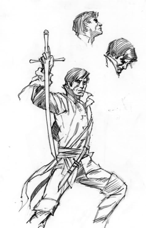
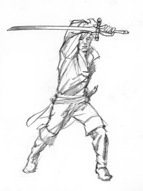
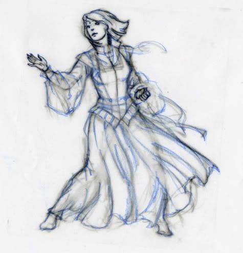
Then I did several preliminary layouts in monochrome acrylics or digital media, sometimes going back and forth between the two.
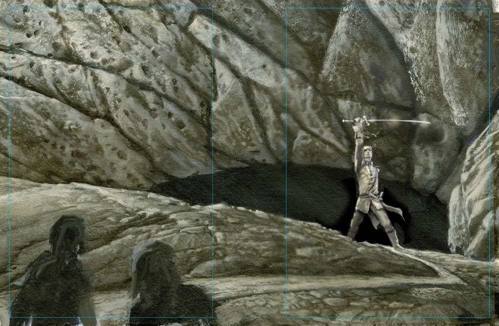
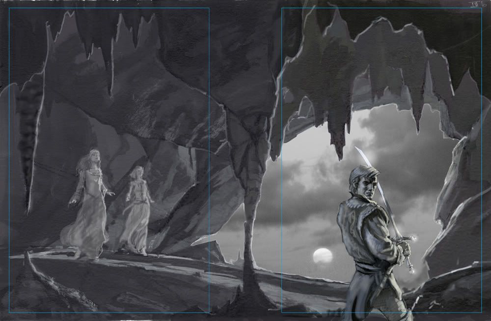
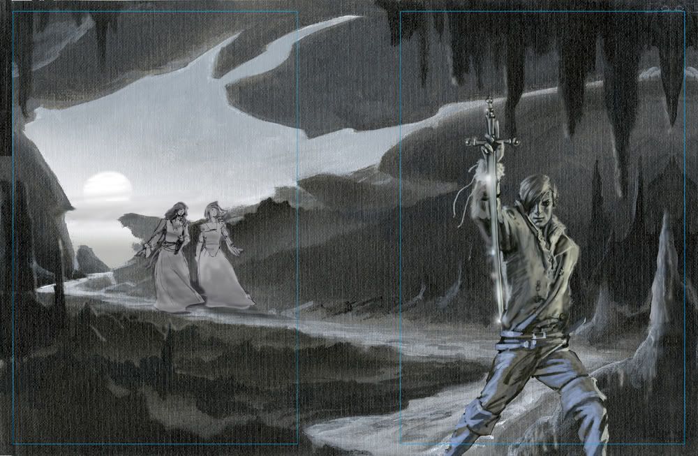
After it was decided which concept to go with, I first played around with my acrylics experimenting with making stalactite shapes using paint and a squeegee. After that, I felt ready to start the background work. Usually I work from background to foreground, but this time I decided to work the middle area first, then do the figure of Rand and the background/sky area at the same time.
Here’s a few shots of the painting as it progressed. The background color of the panel was a light grey tone. The acetate in the center was left in place to mask out the sky area and keep it clean until I was ready to work on it.
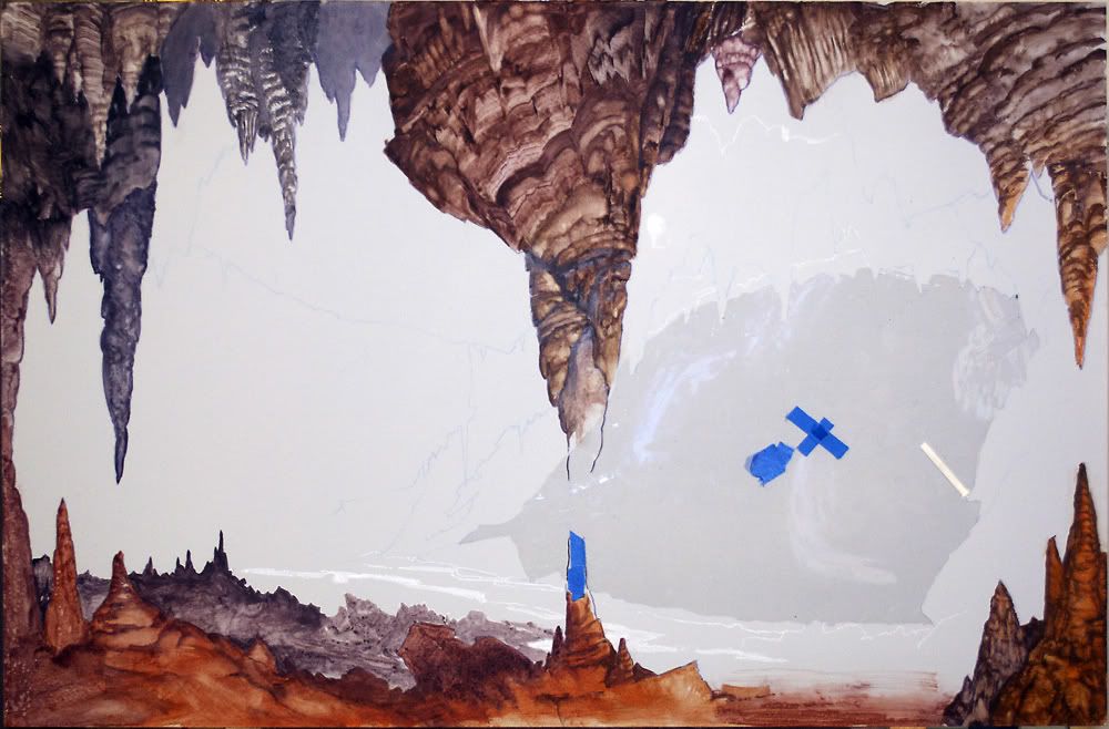
I was fortunately well supplied with cave photos to use as reference because I had recently gone to Carlsbad Caverns in New Mexico, where I took some pictures of some pretty strange stuff:
But I wasn’t happy with my visualizations of the figures, especially Rand. I tried using myself as a model, without much success.
I was also feeling frustrated about the coat I wanted to have Rand wearing in the picture. Sure, I could have faked it if the figure was small in the picture, but with Rand being so “up close and personal” as it were, I thought I should take the time to get it right.
I mentioned all this in a conversation with Dan Dos Santos, and he graciously took the time to help me find a model and find the kind of coat I was looking for. He introduced me to famed illustrator Edward Vebell, which was a humbling experience, I can tell you. Ed’s had a stellar career and is a real pro’s pro—and there were stacks of his paintings all over the place, amazing stuff from the 1940’s onward.
But the thing is, Ed also happens to own an amazing costume collection which he rents out to other artists, photographers, theatre productions, etc. Dan and I almost got lost in his attic looking through the hundreds of coats and military uniforms. We found a couple of likely candidates, and the next day the model came to my studio and Dan shared his photo and lighting setup with me so I could try out his equipment setup.
It was great; almost too good, actually. I felt a little like a guy wearing several watches and never knowing what the real time is. There were so many good reference photos to work with it was hard to cull out one or two to work from and leave the rest. The main thing I look for in posing a model is to check the reality against my visualization of a pose, and correct any errors. Once I had the information I was looking for, things proceeded at a steady pace until the painting was complete.
Tags
-
91
Interview: May, 2012
A Memory of Light Cover Art Round-Up (Verbatim)MRJackson@218 (7 May 2012)
Not sure why there's still confusion. It's Nynaeve and Moiraine on the back cover. The yellow and blue dresses should make that apparent. Nynaeve's hair is obviously shorter than it used to be.
I spoke to Michael about the cover as he was finishing it. Since he didn't have the opportunity to read all fourteen books for the assignment, I was one of the people he leaned on to fact check his work.
Michael mentioned there are details the readers (like me) wouldn't be privy to yet. For example, Nynaeve takes the bulk of her jewelry off before this scene.
Callandor is a sword that isn't a sword, right? He's not holding it for defense. It's a source of power as well as his source of light (there's a clue about that in the lighting on his face). He's shielding his eyes as he stares in to the pit. Apparently, the deeper he goes into Shayol Ghul, the brighter it shines.
A little background that some might not know... Michael has studied martial arts, including Filipino Kali and Arnis. The forearm slash position actually has some utility in fights with bladed weapons.
Compositionally, the line of the sword is another element that draws you into the intensity of Rand's stare. Further, the opening of the cave is the shape of an eye; the eclipse suggests an iris. It's as if the gaze of the Dark One is falling on Rand. We see his strength and determination in response. How many illustrators can convey that kind of depth in a scene?
Say what you will, but I think Michael brought a lot to the plate on what was a very difficult cover assignment. He put his stamp on Rand while producing a cover that fits well with the first thirteen that DKS painted.
analiese@222 (8 May 2012)
Thanks for confirming that. However, Nynaeve's hair is still the wrong color and, while it's shorter after the Aes Sedai testing in Towers of Midnight, it should still be in a shoulder-length braid. She never gave up her signature braid. That's why many people don't think it looks like Nynaeve—the braid is the main thing that would identify her as Nynaeve to the readers.
The loose light hair makes the woman on the cover look more like Alivia, who many fans believe is the woman in yellow. So I'm still of the opinion that Whelan did not do a good job with Nynaeve if longtime fans don't even recognize her. I think it's a beautiful cover, but as a reader, the main thing I care about is seeing the characters—who we have been reading about for twenty years—done right, not so much whether the cave looks realistic or happens to symbolize the Dark One spying on Rand. So it's disappointing that Nynaeve ended up virtually unrecognizable. She doesn't even wear yellow dresses in the books, despite being Yellow Ajah (she makes a point of wearing green or blue since that's what Lan likes), so that's not something that makes the woman's identity apparent either.
If you don't mind me asking (not trying to be rude here, it just strikes me as a bit strange), why did Whelan rely on fans to check his work instead of Team Jordan? I'm assuming you work for Tor, but you refer to yourself as a reader who hasn't read the book. To what extent were Brandon Sanderson and Team Jordan involved with the creative process behind this cover?
MRJackson@223
I was just one of the people helping with the details. Obviously Michael had Irene Gallo's art direction and was in contact with editors including Harriet.
Michael's wife Audrey usually serves as his sounding board, but she hadn't read the books. (For the record, I'm not affiliated with TOR. I've worked with Michael since the mid 90s, primarily on his website.) I'm a WoT fan and that's the kind of feedback Michael was looking for... someone he knew who had read the previous thirteen books.
Michael and I did discuss Nynaeve's dress color. I mentioned that she catered to Lan's color preference of green and blue. The yellow of her Ajah usually came in slashes of color, accents if I recall correctly.
Like I said, I haven't read the manuscript for A Memory of Light and Michael couldn't talk about it. But I distinctly recall Nynaeve taking pride in being a true Aes Sedai finally. Going into the Last Battle, I don't think it's a stretch that she would choose yellow. I suppose we'll have to RAFO on that.
In the background information I provided, I described Nynaeve's hair color as darker brown and referenced previous covers (among them the Melanie Delon's cover for A Crown of Swords that drew criticism for being too red).
I'd have to ask him why he chose lighter highlights. Just my speculation here, but Callandor is a light source. There's also illumination from the eclipse filtering in from the mouth of the cave to consider.
Michael got the length of Nynaeve's hair right, and this isn't simply opinion. Hopefully Brandon or Harriet will confirm at some point that her shoulder length hair was too short to braid.
Interestingly, Michael and I spoke about the challenge of pulling character descriptions from the text. If you're familiar with his illustration, he's known as a stickler for details. But it isn't always easy to translate text literally, especially when Jordan and Sanderson contradict in their description.
In correspondence, Michael wrote,
Michael Whelan
"Major characters are described as diminutive in size, yet 'commanding' in presence. Faces are youthful, yet ageless. Or young but having eyes full of wisdom of the ages. Rand is tall and manly, yet has an almost "feminine" beauty in his eyes or mouth. It's a bit confusing how one is supposed to render such conflicting elements."
MRJackson
Honestly, I don't mind the nitpicking. Criticism comes with the territory. My point in responding is to state that Michael was mindful of details here. There's evidence of it in the painting. I can tell you that he had Moiraine's kesiera and Nynaeve's ki'sain accounted for before I even spoke to him.
On a personal note, I had the privilege of meeting Robert Jordan before a signing on the Knife of Dreams tour. One of the things we talked about was the cover art for the series. I think Mr. Jordan would be pleased with this one. Obviously Harriet was when she said, "that is the Rand I have waited to see for twenty years."
analiese@224
Firstly, thank you very much for the thorough answer. It answered many of my questions, and it was also interesting to hear more about the creative process behind the cover.
[Nynaeve's hair] got singed off "a handspan below her shoulders" (Towers of Midnight ch 20), and she wore a shoulder-length braid in every scene she was in after the Aes Sedai testing. That's why it seemed odd for her signature braid to be missing on the cover. I don't really care about the dress or even much about the hair color, but Nynaeve isn't Nynaeve without her braid—it's part of who she is. It's like Mat showing up without his hat and ashandarei. And the ki'sain is too small to be visible, so it doesn't do anything to make the woman on the cover look more like Nynaeve.
I also wish Nynaeve and Moiraine hadn't been delegated to the background/back cover—since they're going to be linked with him, they deserve to stand at his side. But that's not an error, just something I wish were different.
However, while the cover isn't what I hoped for, I understand and deeply appreciate that you and Whelan both worked incredibly hard on it, and Whelan remains one of my favorite illustrators. I think he did a wonderful job with Rand.
MRJackson@228
I appreciate the sentiment but Michael did the actual work. He pushed his calendar aside this spring to make the cover happen. I was just support. But I will admit it took a lot of restraint on my part not to inundate him with questions that I knew he couldn't answer, so there is that.
As readers, we all have so much invested in this series that I completely understand what you're saying. I love Brandon's work, but I felt Towers of Midnight was a bit of a letdown, especially the resolution with Moiraine.
Moiraine has always been a favorite of mine. I would have liked to see her on the front cover as well. Thankfully Dan Dos Santos gave us that in his brilliant cover for The Fires of Heaven.
Wetlandernw@227
I think MRJackson & Mr. Whelan made a very good point, in that we have not yet read this book. By the time this scene happens, we may see several other events that make sense of the seeming discrepancies. Specifically, there are only two scenes after Nynaeve's testing which mention her braid, and in both cases it is specifically noted that it is too short and she finds it quite annoying. Quite possibly she'll meet up with Lan and find out that he likes it loose, or she'll simply decide that it's too irritating to fuss with a too-short braid, and we'll see her with loose hair in several scenes before this.
Someone was bothered earlier by the missing jewelry—but now we know that she specifically and deliberately removed the jewelry before this scene, probably so that someone else could use them. (That's what happened during the Cleansing; why not here as well?) Seems to me that we should make the assumption that the same kind of thing might happen with The Braid, instead of insisting that she should look like she did in the previous book, and claiming any discrepancies as mistakes. Such claims are not only rude, they are unfounded. Once the book is out and we've read the whole thing, we might have grounds for nitpicking; until then, not so much.
MRJackson—Thank you for your contributions, both to this thread and to Mr. Whelan.
MRJackson@230 (9 May 2012)
Glad to be of help. Maybe someday we'll find closure in the great braid debate...
Seriously though, Michael painted Nynaeve's hair at that length (without a braid) for a reason. I wasn't trying to sidestep debate. I was expressing certainty. Michael was aware that the braid was an identifying feature of her character. The painting turned out the way it did through a long process that involved editorial input. I'll leave it at that.
I look at it this way (and this is my opinion)... Nynaeve has grown enormously through the books. She was always uniquely powerful, but it took time for her to grow into that power. More so, it took a dozen books to accept herself and decide who she wanted to be.
Nynaeve worked through enormous difficulty to channel reliably. Remember how she used to tug on that braid? It really was a symbol of who she used to be. Kind of fitting that the symbol is gone.
Old habits die hard, of course, but she isn't that girl tugging on her braid any more. She's a woman who fought to gain acceptance as an Aes Sedai, and she's going to stand at Rand side to face the Dark One. It's impressive how far she's come as a character.
analiese@
The Fires of Heaven ebook cover was definitely one of the best, though there were a few things the artist got wrong (Moiraine does not have blue eyes). The New Spring cover was great too, especially Lan. It's mostly Nynaeve who has suffered bad luck with the ebook covers. There's A Crown of Swords where she got red hair and Lan looked like an underwater zombie, Winter's Heart where she didn't appear at all despite being linked with Rand for the Cleansing, The Path of Daggers where she got a Saldaean nose and Elayne looked suspiciously like Jean Grey...
I think much of my disappointment with the A Memory of Light cover stems from the fact that there's already an earlier cover (Winter's Heart) where Rand claimed the stage and his female linking partner was left out. "Hero poses manfully brandishing some kind of phallic object" is a pretty tired concept, especially on WoT covers. Rand does the same on Sweet's The Dragon Reborn and The Path of Daggers, the ebook covers for The Dragon Reborn, Winter's Heart, Knife of Dreams... Winter's Heart is probably the worst offender, if you look at the placement of the Choedan Kal. ;)
Sweet's A Memory of Light cover was a welcome break from that—I'm not usually a fan of Sweet's covers, but I liked that he gave Elayne, Min, and Aviendha a prominent role and added some emotion to the cover. So I really would have liked to see something different on the final cover, like Rand having the two women from the Callandor circle at his side. Here, Nynaeve and Moiraine are present, but only in the background, and not at all on the ebook cover.
MRJackson@236
The only female lead who held the cover spotlight on par with the men was Moiraine, and that is a shame.
There was definitely opportunity to feature Nynaeve linked with Rand on Winter's Heart. Despite the hair, I liked Nynaeve on the cover of A Crown of Swords. Lan not so much. The Path of Daggers was another miss, mostly because the colors were a distraction. I thought I was looking at an X-Men cover. Even if that was intentional, it didn't work for me.
I can only assume Rand was intended to stand at center stage alone on the last cover, but I think what you suggest would have been great too. Moiraine and Nynaeve definitely earned their place at Rand's side on the front.
ViciousCircle@264
That was a beautiful description of why Nynaeve is one of the most compelling characters in the series. She and Moiraine kept me invested during some dark years of almost giving up on WOT. I always hoped they would be the other Callandor channelers, as I could not imagine Rand putting himself in such a vulnerable position with anyone else. Aviendha, Min and Elayne included, though I do love Aviendha! So thank you for shedding light on why some things are portrayed as they are on this excellent new cover. Just don't think that it will put a dent in the debate. ;)
MRJackson@266
Thanks. I feel much the same way about those characters, and I'm sure the debate will keep going on well after the publication of A Memory of Light.
Tags
-
92
Interview: May, 2012
A Memory of Light Cover Art Round-Up (Verbatim)Terez@232 (9 May 2012)
Mr. Jackson (your name isn't Michael is it? because that would be unfortunate),
Thanks for the reassurances. Do you happen to know if specs were given for the eclipse? We're wondering if we can assume it's accurately portrayed from the perspective of an astronomer (we have one of those at Theoryland, and a hobbyist as well). That's not to say we can figure anything out about it right now, or even that we'll be able to figure it out when the book comes out judging on recent portrayal of chronology. Just curious. No worries if no particular care was taken to portray it accurately; I understand it's complicated, but it could have been made simple if RJ left notes about it. Also curious as to why it didn't show up until the final draft.
MRJackson@235
We didn't talk about it, but I can ask him. Michael has more than a passing interest in astronomy so it's possible.
And M and R are my initials...
MRJackson@238
Michael's response:
Michael Whelan
The few pages of manuscript I was given to work from didn't have any mention of an eclipse. The subject didn't come up until I had done several conceptual renderings. After sending some of them to TOR I got an email from Irene telling me that if I showed the sky through the mouth of the cave I might want to work an eclipse into the scene.
For reference I looked at a lot of photos of eclipses and liked the idea (for symbolic reasons) of indicating an imminent annular eclipse, the kind where the moon doesn't entirely cover the sun but leaves a thin ring of light in the sky.
Tags
-
93
Interview: Aug 8th, 2009
WorldCon 2009 - Dom (Paraphrased)Dom
Brandon Sanderson
After the Q&A, Brandon stayed around to sign more books and chat and answer more questions. He showed us some awesome concept art he had an artist do to help him envision his Way of Kings concepts. He talked at some length about the main characters and the set up. I must say this sounds like an awesome series—Brandon described it as somewhat midway in style and story between Wheel of Time and A Song of Ice and Fire—or at least it was his goal when he conceived it.Tags
-
94
Interview: Oct 18th, 2004
Elantris Annotations (Verbatim)Brandon Sanderson (Chapter 40)
Originally, I had the steps leading up to Elantris from the outside be a construction put there by the people of Kae. I knew I wanted a large number of scenes on the wall—it is such a dominant visual feature of the book that I thought it would make a good stage for scenes. However, I quickly realized that it would be the people of Kae—not the Elantrians—who controlled the wall. The Elantris City Guard grew from this idea, as did the set of steps constructed on the outside, leading up.
As I worked more and more on the book, however, I came to realize that the pre-Reod Elantrians wouldn't have needed a city wall for protection.
Obviously, to those who've read more, there is a good Aon-based reason for the wall. However, there is more to it than that, as well.
The wall of the city is a symbol—it's part of the city's majesty. As such, it made more and more sense that there would be plenty of ways to get up on top of it.
When we got the cover art back from Stephen, we were amazed by its beauty. A few things, however, didn't quite mesh with the text. One of these was the set of steps—they were so ornate, so beautiful, that it didn't fit that they would have been designed by the people of Kae. At that point, things kind of fell together, and I realized that there was no reason why the Elantrians themselves wouldn't have put a large staircase outside the city leading up to the wall.
And so, in the final rewrite of the book (the ninth draft) I changed the staircase, and the general feel of the wall, to give the proper sense to the reader. The staircase was placed by the Elantrians as a means of getting up on top the wall. The wall itself became less a fortification, and more a wonder—like the Eiffel Tower. It is there to be climbed and experienced.
Tags
-
95
Interview: 2012
Schrodingers_Ferret (June 2012)
Brandon Sanderson ()
My new desktop image.
Thanks!
Tags
-
96
Interview: Jul 11th, 2012
Brandon Sanderson
This is the first year I've been a Special Guest at SDCC. On top of that, Gen Con has me as their Author Guest of Honor and Dragon*Con is bringing me in (for the third time) as an invited guest. With this conflux of awesome conventions happening, I wanted to do some special things. For years, I've wanted to do con exclusives—something to make it worth the effort for people to go out of their way to come see me. And so, this year, we have some awesome things going on. Read below for an expanded list of my SDCC activities.
I do realize that not everyone can make conventions like this, and I'll do my best to make some of these items available to those of you who can't come. However, I'd like to make the con experience a great one for all involved. In addition to simply attending SDCC this year, I have a booth (for the first time) provided for me in Artist's Alley (#II-10). Isaac, who does much of my artwork, and his wife have decided to come and run the booth. I'm hoping this will prove lucrative enough for them that we can do things like this in the future. So please, do come stop by and see us. We will have freebies every day and awesome merchandise. If you know someone who is going to SDCC, send them by to pick something up for you!
Tags
-
97
Interview: Jul 11th, 2012
Brandon Sanderson
EXCLUSIVE ONE:
Feruchemical Table Fine Art Print
Price: $75
As a complement to the Allomantic Table we offered a few years back, we are bringing 100 signed, numbered copies of the matching Feruchemical Table. This wonderful artwork by Isaac Stewart is printed using archival ink and paper. There will be a limited edition of 300 fine art prints, all signed by both me and Isaac. They're absolutely gorgeous. We'll be selling numbers 101–200 at SDCC. The other two hundred are going to be for different cons and, most likely, for a small internet sale after the cons are over. Once these are gone, they're gone—though Isaac may do a smaller, unsigned poster-style print afterward. (Like we did with the Allomantic Table.)
Tags
-
98
Interview: Jul 11th, 2012
Brandon Sanderson
EXCLUSIVE FOUR:
Wheel of Time and Mistborn Temporary Tattoos
Price: Free at my booth!
Each day on Thursday, Friday, and Saturday Isaac and Kara have a promotional temporary tattoo to give away. (A different one each day, while supplies last.) Two are Allomantic symbols, and one is the Snake Wheel logo from the Wheel of Time. (They also have the dragon symbol from the Wheel of Time, but that one misprinted to be tiny. They'll give those away too, but they look a little silly printed as small as they are. Be sure to ask for one anyway—and I believe they'll give those away on any day.)Isaac and Kara paid for these themselves as promotion, so I'm hoping that when you guys stop by the booth, you have a look at the T-shirts they've brought. (A Wheel of Time shirt and a brand new Way of Kings shirt that I'll talk about next.) Isaac is an awesome artist, and he's put a lot of work into the Feruchemical posters and the shirts.

Tags
-
99
Interview: Apr 21st, 2012
JordanCon 2012 - AMOL Update Panel (Verbatim)Question
Is there an expected date yet for the artwork?Harriet McDougal
The final artwork has been delivered by Michael Whelan. And it was gonna be shown to you ravening characters, except that Mr. Sweet has very kindly brought his father's magnificent art, and we decided not to, because we want you to eyeball and enjoy all the beautiful Darrell Sweet which is hanging in the art show, and it's just bursting with life if you haven't seen it yet. It's wonderful. But it should be possible to look at the Whelan...I dunno...Paul, when are you going online? Do you know?
Paul Stevens
I don't know...we were discussing that. [something about a couple of weeks]
Harriet McDougal
Paul's cover copy [?] [something about "I answered you this week..."] "Paul, give me a break! This is JordanCon. Next week?" But it's a beautiful cover. I guess that's an oxymoron...I mean a redundancy; it's Michael Whelan. It really is beautiful, but he is also—I don't know if we spoke about this—but I think he has taken pains to make it a compliment to all of Darrell's work on the series, so it's at one and the same time unmistakably Whelan, but it is also complimentary when it's put up with all the covers racked out. You'll see what I mean when you get a look at it.
Melissa Craib
Excellent. We only have three more minutes, so I have a question here, and then I'll go to Matt.
Question
My question was about Michael's cover. Did y'all have any particular scene that you wanted him to illustrate, or did y'all give him a couple of scenes, and he goes, "Oh..." and [?]
Harriet McDougal
No, in this case, Brandon worked with him at first, and I wasn't really privy with that. It was great; it started out that Michael Whelan was going to do a cover for the ebook of A Memory of Light, and Brandon and Michael were playing together happily. (to Peter) Any comment on that? It was the same scene always, wasn't it?
Peter Ahlstrom
Actually, Michael was curious about one of the scenes that might get deleted, but Brandon said that wouldn't be good for the cover anyway, so...(mic feedback) (laughter) (switches mic) Um...hello? (laughter) It mostly goes through Irene also, so Michael did one main sketch that had the full wrap-around cover, and then he did four alternate front covers, and then Brandon gave his feedback to Irene, and Tom Doherty gave his feedback, and...
Harriet McDougal
So did we.
Peter Ahlstrom
Yeah, and Harriet gave her feedback, and then...so they picked which one they liked the best, and the finished version, I also agree, looks fantastic.
Harriet McDougal
And then of course, when we found that Darrell will very sadly not be here, the decision was whether to use it on the hardcover as well...and it's grand. It really is.
Maria Simons
And there was a section where Michael Whelan sent a bunch of questions to make sure he had everything right, and Brandon had to answer some, and I had to answer some, and so...
Harriet McDougal
And Sam? Is Sam Weber here? Well, Sam told me yesterday that Michael had called him and said, "What's a ter'angreal? (laughter) So thanks to Sam Weber too.
Tags
-
100
Interview: Feb, 2005
Dragonmount Interview with Teresa Patterson (Verbatim)Bob Kluttz
As an artist yourself, what are your thoughts on the artwork in the Wheel of Time world book?Teresa Patterson
I was a little disappointed with the final version of many of the character pieces, but I guess it should be no surprise that the characters as they appeared in my head look different from Todd's vision of them. I think most people have their own vision of how the characters look. I know that R.J. had approval over the initial sketches, but I was disappointed that the finished pieces were not tighter. I can say I would have done them differently—but not necessarily any better. Todd has received a lot of criticism for his pieces in the book. I know Todd was under a lot of stress and pressure, and I suspect it affected the final product more than he would have liked.
The inserts with the Darrel Sweet covers however, are wonderfully reproduced—even though R.J. says Mr. Sweet's covers are not necessarily accurate. Darrell Sweet did the cover of the anthology for my first story, so I have a particular fondness for his work. Elisa Mitchell did a great job with the cover art—though I will never understand why they shrank her piece down and surrounded it with gobs of white space. I guess it was some kind of marketing choice. I was also happy with most of the spot illustrations, ornaments, and maps that she and John Ford and Thomas Canty contributed.
Footnote
RJ explained in another interview that Todd Hamilton kind of got screwed in his contract, which affected the quality of his art.Tags
-
101
Interview: Sep 22nd, 2012
Orem Signing Report - Zas (Verbatim)Question
When is the next Stormlight Archive coming out?Brandon Sanderson
Next fall. If I'm on the ball. That's not supposed to rhyme, but it did. Tor said they'd put it out next fall if I turn it in on time.
Question
When is turn in time?
Brandon Sanderson
April. They said if I get it to them in April, we'll be fine. The trick is, for Michael Whelan to do the cover, I need to give him a cover scene like next month. Because Michael takes his time, because he's the best artist in the business, so you need to turn stuff in early. So I need to decide "What's the cover going to be", and come up with a fantastic cover scene for it.
Question
So is it finished? Is the book finished?
Brandon Sanderson
You can follow on my website, I'm at 7% right now. I have to turn it in in April, so if I can get to 100% by April (or 110% knowing Brandon) we'll be all right. If we can't than it gets a little more sketchy.
Question
Is that turning in the first draft?
Brandon Sanderson
Yeah, we should be able to do it if I turn in the first draft in April.
Tags
-
102
Interview: May 2nd, 2012
Superstars Writing Seminar - Mark Grayson (Paraphrased)Mark Grayson ()
I'll try to sum up a few other things I remember:
Brandon Sanderson
We talked about if he laughed when fans were guessing who wrote what and getting it way wrong. He said the story he could tell about that was someone looking at the chapter titles to tGS and saying they could tell that Brandon wrote those when of course Harriet has named all the chapters since the start.
He was disappointed that DKS couldn't finished the last cover even though he really thinks Whelan is the best fantasy artist around. He likened it to the same as it being too bad that he had to finish the series instead of RJ.
He talked some more about how he felt Mat was the hardest character to get write because he's pretty complicated. His thoughts don't always match up with his actions and it was hard to strike the right tone.
He knows that his action sequences don't sound like RJ's. He said he just doesn't have the real world experience that RJ did as a combat soldier so he just writes them as the best action scenes that he can.
He said Perrin was his favorite character so one of his goals was to redeem the character a bit and make him awesome again.
I asked about his Alcatraz books and he said there will be one more but it's not high on the priority list and will be several years. He also said the Scholastic distribution wasn't great and he's working on buying back the rights and bringing the series to TOR for wider distribution and ebook release.
Mark Grayson
Stuff like that. Nothing that hasn't been covered before.
Tags
-
103
Interview: Dec 3rd, 2012
Brandon Sanderson
Here are two more cool pieces of fan art. The second one is a painting that the artist Megan brought to show me at my signing in Idaho Falls. Thanks!


Finally, the blog The Ranting Dragon is having a "cover battle" that I thought was pretty cool. You can vote for which cover art/design you like best, and the top vote-getters will face off against each other for . . . supreme domination or something. The competition is quite stiff, but the ebook cover for The Emperor's Soul (art by Alexander Nanitchkov, design by Isaac Stewart) is in the first round. I love this art and the design, so I'm happy to see it nominated! You can vote for whichever cover you like, and you can also write in other options. For an explanation of the different rounds see here.

Tags
-
104
Interview: Apr 9th, 2012
Trevor Green
Do you feel like the art you've provided for the various novels has fueled your desire to create your own worlds, or is it a separate animal all together?
Isaac Stewart
Stories and art were always separate things in my head. But my art has somehow begun to pave the way for my own story-related projects. My love of art and story have accidentally collided. It's so obvious, I didn't know why I didn't think of combining them that way before. Talk about the biggest duh-moment of my life.
Tags
-
105
Interview: Apr 9th, 2012
Trevor Green
What are some of the books you've been a part of, and what exactly were you in charge of?
Isaac Stewart
I’m responsible for all the maps and symbols in the four (so far) Mistborn novels as well as all the symbols, chapter headings, maps, color end pages, and Navani's notebook pages in Brandon's Way of Kings. (The other artwork in the book was done by Michael Whelan, Ben McSweeney, and Ben Call. I'm thrilled to be showcased in the same book with these amazing artists.)
On the design side of things, I've been designing self-published books—covers and interiors—for a while, but recently had the luck to get into the business professionally with the book design for Bryce Moore's YA novel, Vodnik. I've also done covers for some ebook re-releases of some science fiction and fantasy classics from the 80s.
In addition to Brandon's maps, I've also worked on maps in the re-release of Robert Silverberg's Nebula-winning novel A Time of Changes and the upcoming reprint of his very-enjoyable Downward to the Earth.
Tags
-
106
Interview: Apr 9th, 2012
Trevor Green
How often does the author end up hating the art that's provided for their book (be it cover design or chapter art)? Has anyone ever been less than thrilled at something you gave them?
Isaac Stewart
Occasionally I hear about authors who aren't thrilled with their book cover. More often, I see cover reveals where the author is ecstatic. Designers, artists, art directors, and publishers really want to design beautiful book covers that will get their books into the hands of those who will enjoy the books the most. In the process, you'll wind up sometimes with authors whose opinions differ from their publisher's, or in some cases, the cover might truly be awful.
No client has ever come to me and said they hated what I did (doesn't mean there isn't someone out there who hates what I've done for them—if there is, they just haven't told me). Usually the process we work through to get to a final idea weeds out the awful stuff. Ideas and thumbnails are thrown out all the time because they stank like week-old dead fish. Sometimes you've got to sift through the fish to find the roses. That's a terrible metaphor, but you get the idea.
Tags
-
107
Interview: Jan 7th, 2013
Brandon Sanderson
Entertainment Weekly has an exclusive cover reveal for my YA post-apocalyptic novel Steelheart that's coming out from Delacorte in September. Check it out here.
Also, Tor.com put up the prologue and first chapter of my YA fantasy The Rithmatist that's coming out in May. Read them here. (Illustrations by Ben McSweeney, who also did the Shallan's Sketchbook illustrations in The Way of Kings.)
Tags
-
108
Interview: Jan 9th, 2013
Brandon Sanderson's Blog: It's finally out. (Verbatim)Brandon Sanderson
I'm sitting here on a plane, flying to Minneapolis after signing 1280(!) books last night at the midnight release of A Memory of Light. That marks it as my largest signing ever, though a whole lot of readers (understandably) grabbed their pre-signed books and ran off to read them, rather than waiting for a personalization.
Harriet did a reading, which my good friend Earl filmed (along with the Q&A). I'm sure he plans to post that as soon as the editing is done, and we'll get you a link. I'll be doing many more signings and readings in the coming weeks. (Of special note is the signing in Lexington, where the bookseller wanted me to let you know that he has been able to get Michael Whelan to send prints of the cover of A Memory of Light. See below this post for details.)

Tags
-
109
Interview: Jan 9th, 2013
Brandon Sanderson's Blog: It's finally out. (Verbatim)Question
You said something about cover art prints of A Memory of Light?
Brandon Sanderson
Yes! Brian from Joseph-Beth is one of those booksellers mentioned above. From the start of my career, he's been in my corner, rooting for my books to do well. (And he has probably hand-sold more copies of my books than any person other than myself.) He tends to do awesome things for booksignings. This time, he called up Michael Whelan and asked if he could somehow get prints of the cover to sell.
The result is that we're going to be selling them at that signing, and ONLY that signing. In fact, so far as I know, this is the only place to get prints of the cover painting right now. Mr. Whelan has already signed each one, and I'll be signing them when in Lexington. [Assistant Peter's note: Michael Whelan will also sell them on his own website—we'll put up a link later—at the same price ($95), but getting it from Joseph-Beth will be faster. If you're not going to the signing you can order it here. There may also be a few prints of the The Way of Kings cover painting available at the signing itself.]
Tags
-
110
Interview: Jan 7th, 2013
Ed Huyck
When did you first start reading The Wheel of Time, and what were your initial impressions of the stories and the writing?
Brandon Sanderson
I still remember the first time I saw The Eye of the World on bookshelves, at age 15. I can almost feel that moment, standing and holding the book in my hands. I think the cover of Eye is the best [longtime series cover artist] Darryl Sweet has ever done—one of the best in fantasy. I loved the cover. The feel of the troop marching along, Lan and Moiraine proud and face forward. The cover screamed epic. I bought the book and loved it.
I still think Eye is one of the greatest fantasy books ever written. It signifies an era, the culmination of the epic quest genre which had been brewing since Tolkien initiated it in the '60s. The Wheel of Time dominated my reading during the '90s, influencing heavily my first few attempts at my own fantasy novels. I think it did that to pretty much all of us; even many of the most literarily snobbish of fantasy readers were youths when I was, and read The Eye of the World when I did.
Tags
-
111
Interview: Jan 8th, 2013
AMOL Signing Report - Grant (Paraphrased)Question ()
What about the main character that was removed from The Eye of the World?
Harriet McDougal
He didn't do anything until book 4. So he got cut.
Tags
-
112
Interview: Jan 4th, 2013
NPR Interview with Harriet McDougal (Verbatim)Petra Mayer
So what was your role? I know you picked the chapter titles, but describe for our listeners your role in sort of the creation and editing of the series.
Harriet McDougal
Well, in The Eye of the World in particular, in the beginning there were four boys leaving the village, but one of them didn't have anything to do. And my husband said, "Well, I had plans for him for the fourth book." And I said, “If you bore people, then there never will be a fourth book. Cut that boring kid out.” So he did.
Petra Mayer
Yeah. There are only three, in the final.Harriet McDougal
Yes, that's right. The original cover art—the kind of brownish cover art that was on the inside cover—does show four, which is rather ghostly.
And another thing . . . Nynaeve . . . I helped him develop her by saying, "Why on earth is she always riding up there to talk to Moiraine? She doesn't seem to have anything to talk about." And I said, "Maybe she's trying to show her that she knows her way around herbal remedies." So a major piece of Nynaeve's character slid into place with that.
Petra Mayer
Oh, that she was the Healer and the Wisdom.
Harriet McDougal
Yes, the village Wisdom—for people who haven't read the books, we're getting into some detail—but you might be interested that the village the main characters come from has a mayor and a Council, who are all men. But the village Wisdom (laughs) is the wise woman of the village, and generally represents the power of women. It's a very egalitarian world as far as gender is concerned.
Petra Mayer
I did notice that, yeah.
Tags
-
113
Interview: Aug 31st, 2012
Daily Dragon
Shallan's sketches in The Way of Kings are terrific additions that enhance the epic feel of the novel. What inspired you to push for these illustrations?
Brandon Sanderson
I wanted to use the form of this novel to try and enhance what epic fantasy can do, and downplay the things that are tough about it. One of the tough things about epic fantasy is the learning curve—how much you have to learn and pay attention to, how many things there are to just know. I felt that occasional illustrations could really help with that. For instance, how Shallan's sketchbook, or uses of multiple maps, could give us a visual component to the book. Pictures really are worth a thousand words. You can have on that page something that shows a creature much better than I can describe it. And so I felt that that would help deemphasize the problem of the learning curve, while at the same time helping to make this world real. Epic fantasy is about immersion, and I wanted to make this world real since that's one of the great things we can do with epic fantasy. We've got the space and the room to just build a completely real world, and I felt that the art would allow me to do that, which is why I decided to do "in world" art.
I didn't want to take this toward a graphic novel. I like graphic novels, but it wasn't appropriate here to do illustrations of the scenes and characters from the books because I don't want to tell you what they look like. I want that to be up to your own imagination. And so we wanted that in-world ephemera feel to it, as though it were some piece of art that you found in the world and included.
I think it goes back to Tolkien. There's a map in The Hobbit, and that map isn't just a random map, which has become almost a cliché of fantasy books and of epic fantasy. "Oh, of course there's a random map in the front!" Well, Tolkien wanted you to think this map was the actual map the characters carried around, and that's why he included it. He wrote his books as if he were the archivist putting them together and translating them and bringing them to you, this wonderful story from another world, and he included the map because the map was there with the notes. That's what I wanted the feel for this ephemera to be. As though whoever has put this book together—done the translation and included pieces of art and maps and things that they found in the world that had been collected during these events—that's what you're getting.
Tags
-
114
Interview: May 11th, 2012
Brandon Sanderson Interview (Verbatim)Sean
On your website, the completion status for the next book in the Stormlight series has been stuck on 0% for too long in my opinion. When do plan to get it written? And is there any hopes that Michael Whelan will do the cover?
Brandon Sanderson
I plan to jump right into the next book in the Stormlight Archive series as soon as I finish up with The Wheel of Time. I feel extremely honored that Michael Whelan came out of semi-retirement to do the first cover so I can't rightly expect him to paint the next one but we'll just have to see what happens. It was a dream come true to have him do the cover of one of my books.
Tags
-
115
Interview: Oct 3rd, 2007
Robert Thompson
Cover art is another area that is very important to you and one of the highlights of your books has been the uniquely breathtaking artwork. That trend continues in The Well of Ascension as artist Jon Foster (Mistborn: The Final Empire) outdoes himself in what I think is the best cover yet. So, just wondering what your thoughts are on how the artwork for The Well of Ascension turned out, how it stacks up to the other books’ covers, and any other thoughts you may have on the topic?
Brandon Sanderson
I really liked Jon Foster's art. I think he captures movement and action well, which was excellent on the Mistborn covers. Foster's covers almost look like stained glass pieces themselves, and with the sort of gothic cathedrals I had in mind for some of the scenes of The Well of Ascension, this was perfect. As far as my personal opinion, I like the cover of Well better than that of Final Empire, but not quite as much as the cover for Elantris. I have to say, though, that the image they've chosen for Mistborn 3 may make it my favorite cover yet.
Tags
-
116
Interview: Feb 1st, 2013
AMOL Signing Report - Deslya (Paraphrased)Question
Androl is like your character, so as far as that, how much of that was kinda fought by the rest of Team Jordan as far as his gateway talent and stuff?Brandon Sanderson
Let me start by saying that if they hadn't been happy, it wouldn't be in the book. But anything where you work with an editorial team, you'd show them a scene, and they may say that's great, or they may say that it doesn't feel right or wouldn't be a good fit for the story. And sometimes you'll say "I'll change it" or "let me finish this draft, and we'll see what it looks like at the end". As far as the gateways, I felt it wouldn't be realistic otherwise. I've wanted to do with gateways since I was a kid, doing things like I showed in the book. If I had them, what would I do with them? I asked this when I was a kid, so there was a lot that I wanted to do with gateways that were in my own notes that I wanted to do that I couldn't do in my own books, so I stayed away from things that the Wheel of Time had done. So when I got to write WoT I broke out those files. The gloves were off; it was time to do things that I wanted to do but didn't want to rip off the Wheel of Time. At the end of the day, I convinced them to do it. They kept saying "they're all over the place!" so I said "if you could use them, you'd use them a lot". I didn't intend it to be a shout out of any kind, it's things I've wanted to do with gateways for like 15 years. It wasn't a shout out to the fandom. It's been an interesting experience. A lot of people think that I just wrote what the fans thought, but it's things that I felt the characters and the world would do, and if the fans happened to have talked about it, it's because it's what I thought would happen. In fact, as I wrote the books, I read very little of the fandom in order to prevent those exact thoughts from taking root.
Chris W
During and after the signing, we had the discussion with Brandon about Dannil Lewin. Originally, Dannil had actually gone with Rand, Perrin, and Mat from the Two Rivers on their journey, and played a major role in events of book 3 or 4. In the end, Harriet convinced RJ that it may be better without Dannil, so some of Dannil's comments in A Memory of Light are a shout out to that of sorts. Just a fun story I thought you all might find interesting.
Footnote
Tags
-
117
Interview: Apr, 2003
Ekultúra: Interview with Robert Jordan (Translated)Galgóczi Móni
Into how many languages were these books translated?Robert Jordan
I daresay it's into 22-23 languages. We most recently signed contracts with the Turkish, Taiwanese, and Korean publishers.
Galgóczi Móni
How satisfied are you with the translations and the covers of the books published in all the different countries?
Robert Jordan
Overall I am satisfied, though there are one or two countries where the appearance of the covers seems a bit odd to me.
Tags
-
118
Interview: Jan 29th, 2013
Brandon Sanderson
Michael Whelan has put up an awesome post on his process for painting the cover of A Memory of Light. Very, very cool. If you're at all interested in art or illustration you should check it out. You can also buy signed prints in his store.
Tags
-
119
Interview: Feb 19th, 2013
AMOL Signing Report - Rob B (Paraphrased)Rob B
Harriet McDougal (paraphrased)
I spoke to Harriet about the covers in the series, remarking how she indicated when she saw Whelan's cover for A Memory of Light she said "that is the Rand I have waited to see for twenty years". Harriet then said how Whelan's art, though his own style, she felt, was able to mesh with the sensibilities Sweet had always brought to his covers, in particular the landscapes. I asked her what her favorites of the covers were she immediately said The Eye of the World as a classic, she thought another moment and said she liked The Shadow Rising.
Tags
-
120
Interview: Mar 18th, 2013
Harriet McDougal
I get a lot of questions about Dannil, the character who was cut out of The Eye of the World. Dannil sort of figures in that cover painting. [Referring to a painting of an Eye of the World poster in Tom Doherty's office.] There's an extra character in there. He has a ghostly life.

Tom Doherty
Darrell Sweet was doing many of the biggest fantasies in the 1990's.
Harriet McDougal
Yes, using his work was a big expense for a little company. It was one of the ways in which you did such a superb job of publishing. Also, what's so nice about the gorgeous Michael Whelan cover for the last book is that it's obviously a Michael Whelan, but he very tactfully made it so that when you rack them all out, they look like family. That was a lovely thing he did.
Irene Gallo
It is. He did a good job. The palette and compostion really works with the other covers. I didn't envy him the job and he turned it into a nice tribute as well as a conclusion.
Harriet McDougal
And Sam Weber is so nice. I keep trying to call him Sam Weller because of Dickens. He said Whelan called him once and asked: "What's a ter'angreal?"
Looking at The Way of Kings, I had an extraordinary coincidence. A friend of mine's former wife is a curator at the Phillips Collection in Washington. She's a descendent of John Martin, an English painter also known as Mad Martin. He was the highest paid artist in Great Britain in the 1840's, and then he sank into total obscurity until a couple of war refugees rediscovered and resurrected his works after World War II. One of his paintings is the cover of The Way of Kings, except that there's a big pantheon where the guy is in the distance.
Irene Gallo
I'm going to look that up.
Harriet McDougal
His skies are very much like Michael Whelan's. He was doing all that stuff way back then. I don't know if Whelan's ever looked at him, but it looks as if he has. Those fabulous skies of Whelan's.
Tags
-
121
Interview: May 17th, 2013
Rithmatist Signing Report - Kogiopsis (Paraphrased)Kogiopsis
How much control does he have over the Words of Radiance cover?
Brandon Sanderson
Some, by dint of being fairly well-known in the industry, but he's really fond of Whelan's work and more likely to pick a direction from concept sketches than push Whelan somewhere entirely new.
Kogiopsis
(I asked if he could, for instance, hold firm for epicanthic folds on Rosharan characters; he said probably yes, but most of Whelan's cover work has been figures in the distance for now so that isn't likely to be an issue. I didn't feel comfortable asking the same question over again re: skin color.)
Tags
-
122
Interview: May 1st, 2013
Brandon Sanderson
Michael Whelan has signed prints of the A Memory of Light cover painting, that Harriet and I also signed at JordanCon. They look great!

Tags
-
123
Interview: May 3rd, 2013
Brandon Sanderson
I got back from JordanCon a few days ago. Often times at cons and signings, my readers bring me small gifts. I'm deeply grateful for the time and thought put into these, and I try to post pictures of some of them from time to time. JordanCon was no exception. Here are some of the cool things you all gave me.
A highlight of the con for me was going to lunch with one of my idols, Michael Whelan. (For more on how much I love his work, see here.) He gave me one of the signed limited editions of The Art of Michael Whelan, which includes a beautiful original illustration (below). The book and the illustration are absolutely gorgeous. I can't wait to see what Michael comes up with for the cover of Words of Radiance.


Tags
-
124
Interview: Apr 15th, 2013
Reddit AMA 2013 (Verbatim)josephwdye ()
Hello Brandon !!! One of my favorite question with people with a good sized fandom, What are some your favorite fan made stuff ? Be it fan fication, art, crafts. I hope this isn't too late <3 .
Brandon Sanderson
I generally stay away from reading fanfiction done on my work, for various reasons, though I don't have a problem with people writing it. I think the coolest thing is when I get fanart from the books; it helps me understand how people are visualizing my characters, and it gives me a boost to see that what I've written has inspired other artists.
Tags
-
125
Interview: Apr 15th, 2013
Reddit AMA 2013 (Verbatim)shardfan ()
I am a big fan and, being a wife to an aspiring author, I sometimes think about what your schedule must be like for your family. Sometimes you talk about twelve hour work days and I'm wondering do you get to spend a decent amount of time with your wife and children?
Also, I am currently reading Alcatraz Versus the Evil Librarians and this book is sheer wit. Sadly, the cover has made me uninterested for years. I actually first saw the book at the 7th Harry Potter midnight opening party at the Border's in Provo. We've all heard not to judge a book by its cover but, seriously, do you have any say in the cover art or is it one of those things you just have to sign over?
Brandon Sanderson
Balancing this can be hard, but it's not so bad now that I'm published. I work long hours some days, but I always steal the extra time from leisure, not family. I finish work at 5:30 most days, hang with family until nine or ten, then go back to work. The lack of a commute makes it so that long hours don't really steal time from the family, which is very important.
I would say that it's harder for an aspiring author. I'd suggest that your husband make specific writing goals, and section off time—and everyone agree to leave that time alone. (Whether it be four hours on a Saturday each week, or an hour at night when everyone else is watching TV.) It can be done in a way that doesn't leave the family lonely, but it requires careful management.
As for the cover of Alcatraz...no, I'm not fond of it. I never have been. This was very early in my career, however, when I didn't have much influence over such things. We did complain as the covers to the series got worse and worse, but our complaints fell on deaf ears.
Tags
-
126
Interview: 2012
gyroda (September 2012)
Fantasy novel cover art
Thought I'd just put this out here, I've noticed that the American cover art and British cover art tend to be very different, the British ones tend to be more minimalistic with a little overdose of "Hooded-ninja-wizard" whereas the American ones seem to have more in them, like they're displaying a scene from the book.
Just wondering, which does everyone prefer and why? I kinda prefer the British ones (although I might be biased there, I'm too used to them) as the American ones seem a bit cheesey and off-putting a lot of the time.
Examples (including some hooded-ninja-wizards):
Mistborn 1 UK US
Assassin's Apprentice UK US
Magicians' Guild UK US
The Painted Man UK USFeel free to bring up other countries covers as well. I just picked those two as they're the ones I see most often.
Brandon Sanderson ()
My editions from Spain tend to look like daytime soap operas.
The Japanese, unsurprisingly, is manga-like.
Tags
-
127
Interview: Aug 31st, 2013
WorldCon Flash AMA (Verbatim)bonehunter (August 2013)
What are your thoughts on the cover for Words of Radiance? I know there has been some criticism, but I think it's great. The Way of Kings is one of my favorite covers in recent memory, as well.
Also, does it look like there will be extra copies of Firstborn/Defending Elysium that will end up on sale eventually?
Brandon Sanderson
I love the cover, but I'm a self-professed Whelan fanboy. It's hard for me to be objective about his work.
I'm pretty sure we'll have leftovers. Peter (my assistant) was adamant about ordering enough copies that everyone on-line can get a copy if they really want one. So we'll have enough to sell through the holidays, I'm pretty sure. As this is my last con of the season, they'll probably go up soon.
Tags
-
128
Interview: Mar 21st, 2014
WOR Signing Table Q&A (Verbatim)Question
Do you have any say in your covers?Brandon Sanderson
I have a lot more than I used to. Originally, not much, though Tor, to their credit, even the first cover asked me—gave me a choice of three illustrators, and said "which of these three would you like the most? And then I picked Stephan Martiniere, and I got the cover from him, that I really liked. Nowadays I can say "give me this artist" and they do.Tags
-
129
Interview: Mar 21st, 2014
WOR Signing Table Q&A (Verbatim)Question
I was writing about the stances, and I was wondering if you could match them with (unfolds drawing).Brandon Sanderson
I would have you email this to us, because Ben McSweeney made the final call as he drew these, which one was which. While I had notes on each of them, he matched the stances to them, so it would be really easy for me to get them wrong.Tags
-
130
Interview: Sep 4th, 2014
Salt Lake City Comic-Con 2014 (Verbatim)Question
Is there any reference material for doing cosplay?Brandon Sanderson
It depends on the costume that you want to make. We have lots for The Stormlight Archive, less for other books. So if you want reference material for Stormlight costumes you can write us and we'll send you the concept art we are using.Tags
-
131
Interview: Oct 12th, 2015
Alterodent
Does Shallan's bond improve her art?Brandon Sanderson
Shallan's memorization is supernatural, and her memorization affects her ability to do art, so I would say yes.Tags
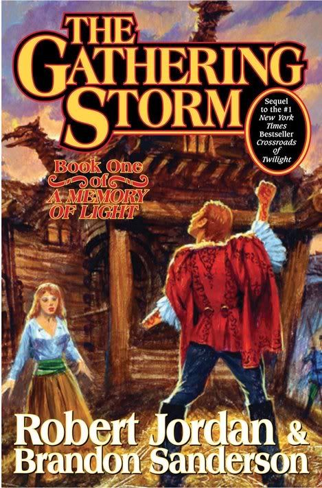
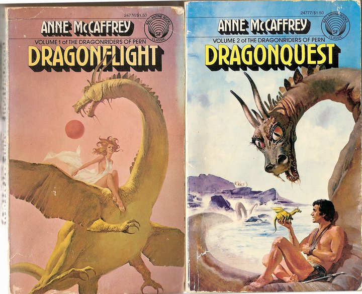